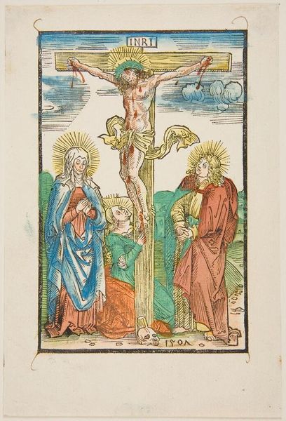
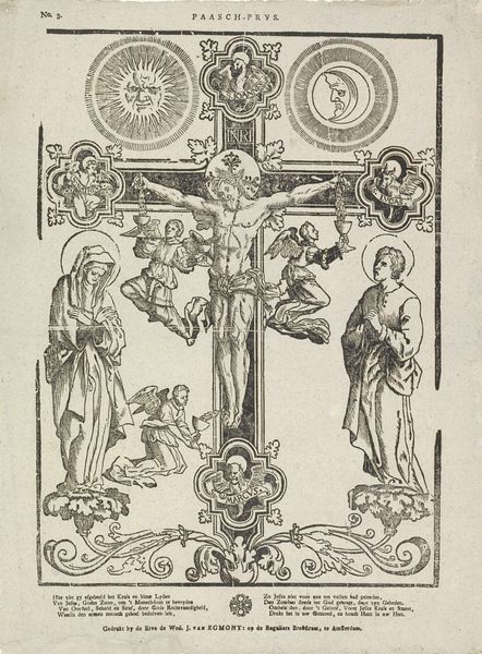
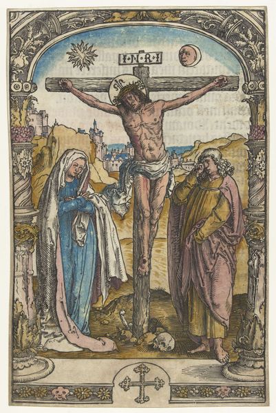
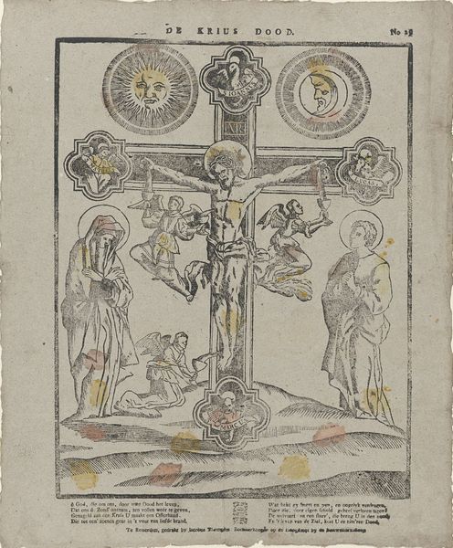
tempera, print, fresco, engraving
#
tempera
# print
#
figuration
#
fresco
#
line
#
watercolour illustration
#
history-painting
#
engraving
Dimensions: height 424 mm, width 295 mm
Copyright: Rijks Museum: Open Domain
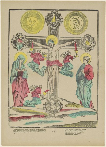
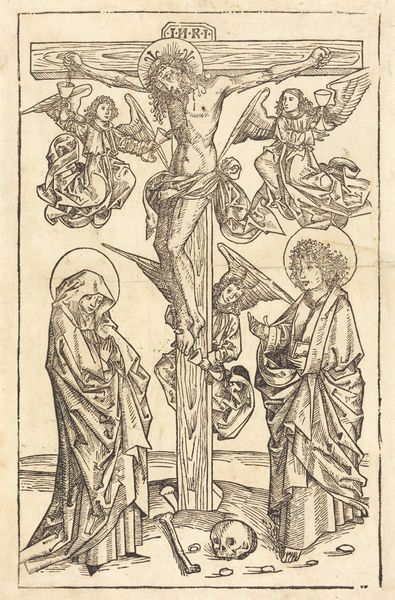
Editor: We’re looking at Franciscus Antonius Beersmans’ "Christus aan het kruis," which translates to Christ on the cross, dating from between 1866 and 1902. It’s rendered with tempera, print, and fresco. It's got a very stylized, almost medieval feeling to it, doesn’t it? The colors are surprisingly vivid, and the line work is so precise. What leaps out at you when you see it? Curator: What strikes me is how Beersmans uses seemingly simple lines and colors to evoke a profound sense of emotion. Look at how Christ’s body is elongated, almost ethereal. There’s a tension between the clear symbolism of the sun and moon –representing perhaps divine and earthly realms– and the almost cartoonish faces. Does it feel like a sincere expression of faith or a more critical commentary to you? Editor: Hmm, I see what you mean. I initially read it as very devotional, but those sun and moon faces do have a slightly unsettling quality. The hovering angels holding chalices also seem…out of time, like they could be from a completely different artistic era. Curator: Precisely! It’s this blend of sincerity and something…else… that holds my attention. It’s not just a straightforward religious image; it feels like Beersmans is grappling with faith, tradition, and his own artistic voice. What do you make of the landscape at the bottom? It seems like such a minor detail, almost like an afterthought. Editor: That's interesting; I hadn’t really noticed it! Now that you point it out, it *is* quite minimal. Almost like a stage setting, placing the crucifixion within a simplified world. I guess it underscores how the figures are the focus, really bringing them to the foreground. Curator: Yes! Perhaps he’s inviting us to reflect on the humanity amidst the divinity, the earthly setting for this momentous spiritual event. It’s not just about what’s depicted, but how we, the viewers, engage with it. That, for me, is the lasting power of Beersmans' work. Editor: This definitely made me think differently about this print! Thanks for the insights.
Comments
No comments
Be the first to comment and join the conversation on the ultimate creative platform.
More like this