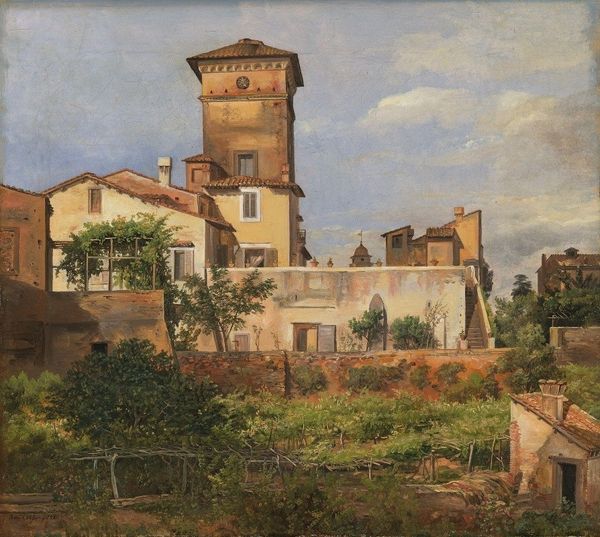
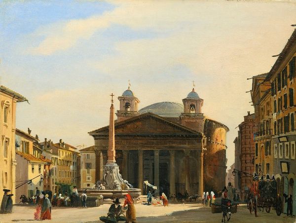
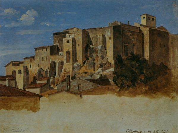
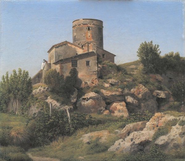
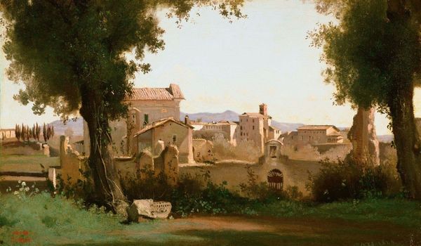
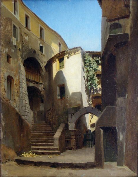
painting, oil-paint, architecture
#
neoclacissism
#
painting
#
oil-paint
#
landscape
#
oil painting
#
cityscape
#
history-painting
#
academic-art
#
architecture
#
realism
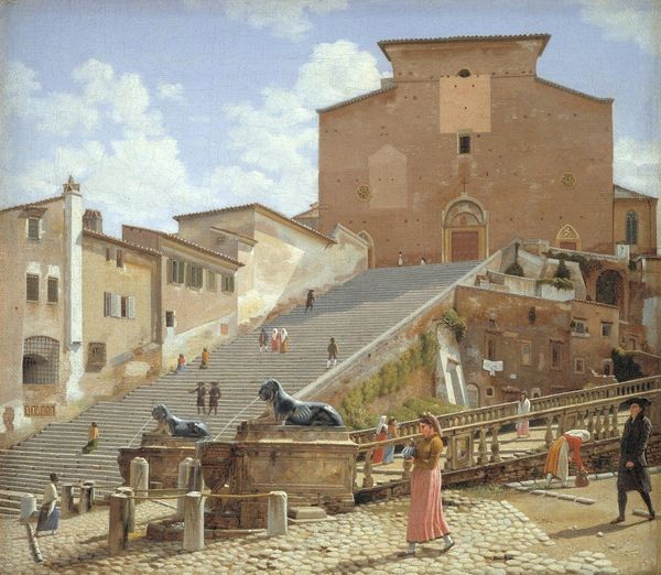
Copyright: Public Domain: Artvee
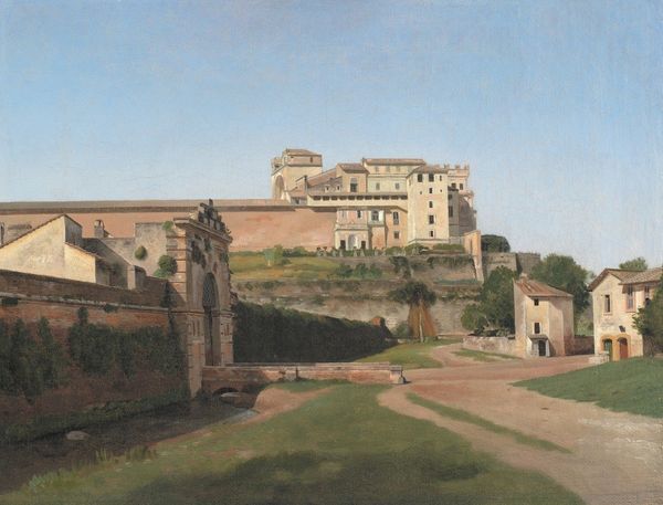
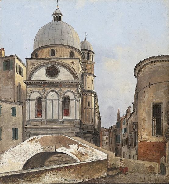
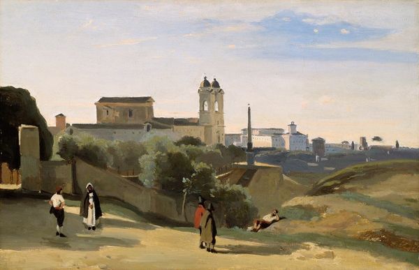
Editor: So, this is "A Section of the Via Sacra, Rome," painted around 1814-1815 by Christoffer Wilhelm Eckersberg, using oil paint. It’s a lovely depiction of a cityscape in warm, muted tones, but it feels almost… staged, like a theatre set. What do you see in this piece from a formal perspective? Curator: What strikes me first is the artist's meticulous rendering of form and light. Note how Eckersberg constructs space through carefully calibrated tonal variations, not dramatic contrasts. This meticulous rendering draws attention to the geometry and textures of the architectural elements. Consider the dome’s curve in relation to the rectangular solidity of the building beneath it; how do these shapes speak to each other? Editor: I see what you mean! It’s all about the shapes and how they fit together. The shadows also create interesting lines that guide the eye. Does the subdued color palette play a role, beyond just creating a sense of realism? Curator: Precisely. The restricted palette pushes the viewer to perceive subtle gradations in tone and value, forcing us to focus on the pure, abstract forms. There is almost a dialogue between warm and cool hues; the buildings displaying ochre and the trees a cool viridian tone. Would you say there is any evidence of "painterly" brushstrokes here, or does the artist work to suppress their presence? Editor: I think it's definitely the latter. The surface is so smooth; the brushstrokes are nearly invisible, aren’t they? So that forces you to look at the shapes and structures. Curator: Precisely! The artwork becomes less about the artist's gesture and more about the relationships between forms, which aligns directly with the formalist principle. Thank you for guiding me through your observations. Editor: It was quite illuminating. I hadn't thought about the color being used to direct us to the forms, rather than just being, well, realistic.
Comments
No comments
Be the first to comment and join the conversation on the ultimate creative platform.
More like this