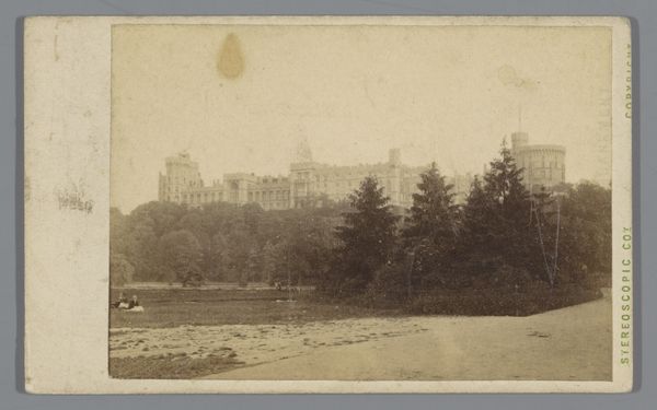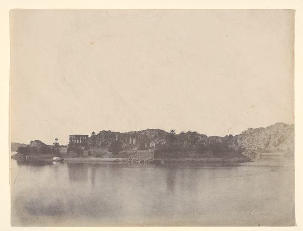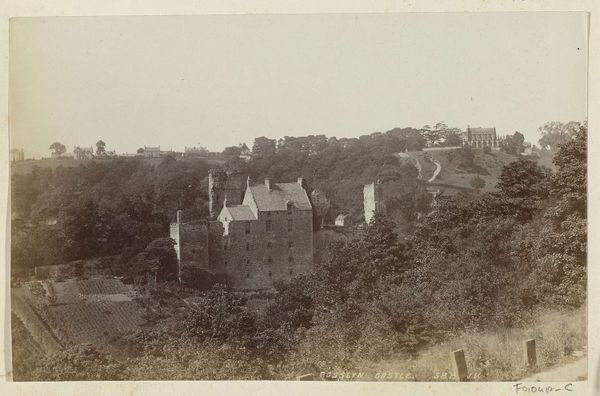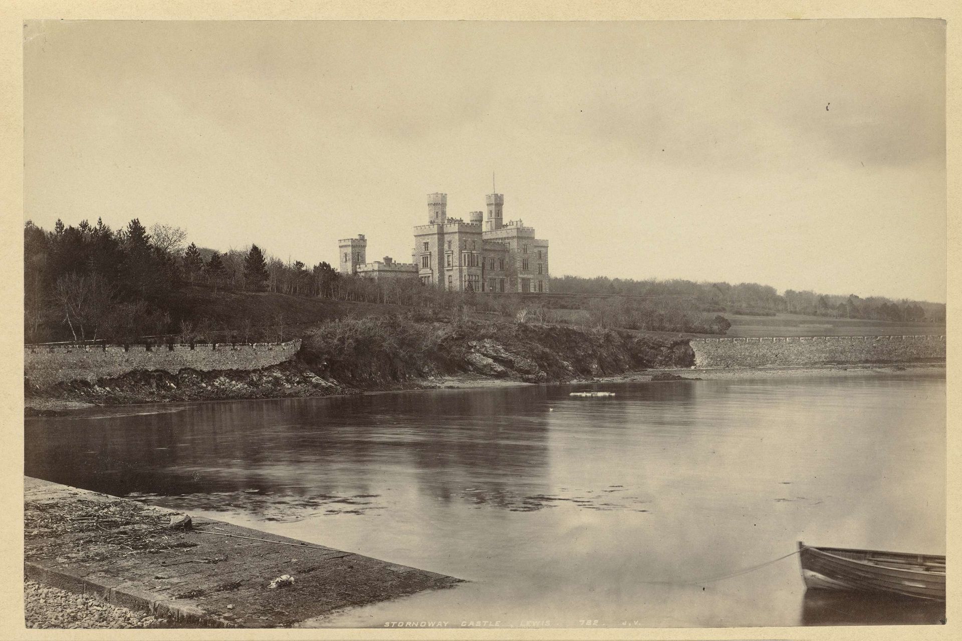
1851 - 1880
Lews Castle nabij Stornoway op Lewis in Schotland
James Valentine
1815 - 1880Location
RijksmuseumListen to curator's interpretation
Curatorial notes
Curator: We're looking at "Lews Castle nabij Stornoway op Lewis in Schotland" by James Valentine, a gelatin-silver print, likely created sometime between 1851 and 1880. Editor: It exudes a sense of restrained grandeur. The castle’s geometric volumes sharply contrast with the almost desolate expanse of water, creating a rather solemn mood. Curator: Note how the composition relies on distinct planes—the foreground with the small boat, the reflecting water leading to the midground of the castle grounds, and the castle itself set against a subtle, clouded sky. The light, though soft, clearly defines the architecture. Editor: The subdued tones almost feel intentional. It’s interesting to think about the photographer’s decisions, perhaps due to the limitations of the medium but also because of cultural context: how they wanted to capture not just a place but also a prevailing sensibility linked with Scottish identity and maybe the Victorian fascination with landscape. I would also add the role that labor and craft traditions play in the architecture. Curator: Certainly. Pictorialism was known for its painterly approach. But examine the way the architecture punctuates the landscape, particularly the shadows. It lends a weight and permanence despite the hazy softness characteristic of Romanticism. I see also a calculated manipulation of tone that creates an atmosphere of subdued awe. The light, even in its dimness, isolates forms and provides spatial definition. Editor: Right, it evokes a world slowly being defined. It almost feels like viewing a historical document from an emergent society coming into view: The materials – stone, water, boat – have always been present in this setting, though maybe organized according to cultural shifts regarding land or power. Curator: Valentine clearly employed aesthetic means for specific visual ends—the balance, contrast, tonal distribution, all in concert to communicate power structures between man and nature as it concerns framing, organization, and control. Editor: And to think, the processes needed for production and presentation have shaped the way those messages have materialized—allowing for both control of content and potentially new ways for understanding material history as technology evolves with cultural change. Curator: It all provides a very interesting perspective through an intentional layering of aesthetic choice and a record of its time. Editor: A powerful glimpse into the material past mediated by chemical processes and subjective perspective.