1724
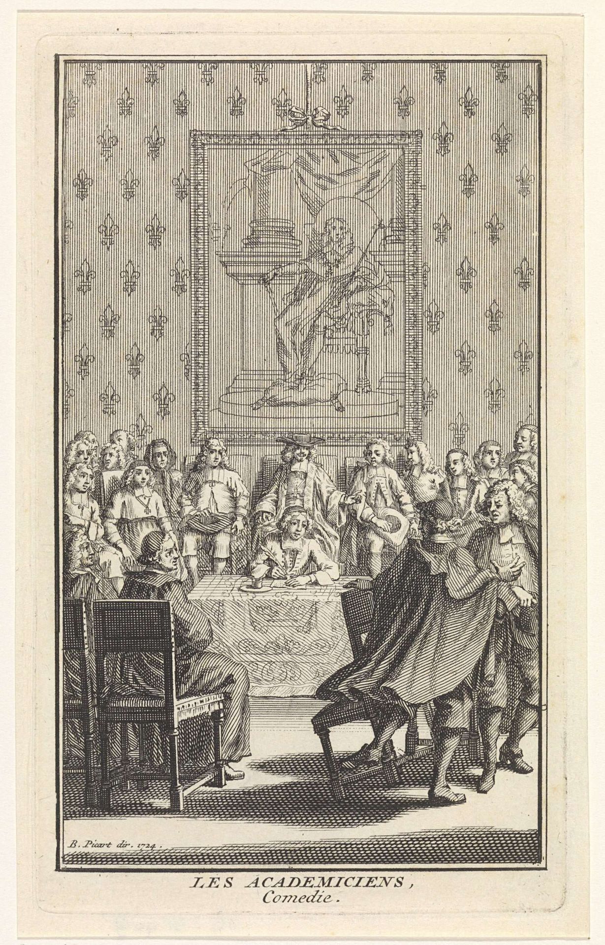
Heren rond een tafel
Bernard Picart
1673 - 1733Location
RijksmuseumListen to curator's interpretation
Curatorial notes
Curator: "Heren rond een tafel," or "Gentlemen Around a Table," crafted in 1724 by Bernard Picart. It's currently housed here at the Rijksmuseum. The print combines pen, ink, and engraving techniques to depict… well, what are your initial thoughts? Editor: Crowded! My first impression is the density. It's a tightly packed composition, almost claustrophobic. The use of line and the lack of shading creates a sense of flatness, pushing everyone forward. Curator: The flatness, yes. Considering its creation as a print, destined for mass production and distribution, this aligns perfectly. The limitations of engraving demanded clarity over nuance, facilitating efficient replication and consumption. How does this relate to Baroque group portraiture in general? Editor: Structurally, the figures form a frieze-like arrangement across the middle ground. This recalls classical precedents, but with a baroque sense of immediacy. What I mean is this isn’t stiff, formal portraiture. There is gesture, expression, interaction happening… Curator: Indeed, Picart was able to translate the Baroque aesthetic for the masses through accessible, reproducible engravings, skillfully blending artistry with commercial appeal, while challenging existing notions of the value and accessibility of art in society. I think what stands out is not the technique of creating form in the artwork, but instead how he managed the work process, because he needed it mass produce it at scale. Editor: Yes, although his mastery of the engraver's burin is apparent! Note the varying line weights to simulate depth. Consider also the backdrop with fleur-de-lis which adds texture. Beyond the subject—academics—the artwork itself showcases technical prowess within a constrained medium. It does so even with minimal shading. The light catches different planes on different faces and folds on sleeves just so... Curator: This piece certainly exemplifies the blending of social commentary, artisanal practice and market-oriented output within early 18th-century printmaking. Editor: From my view it makes Baroque dynamism readable. Each line plays its part within this social, spatial geometry, offering insight into form and light—even social standing through clothing! I've seen enough. What should we examine next?