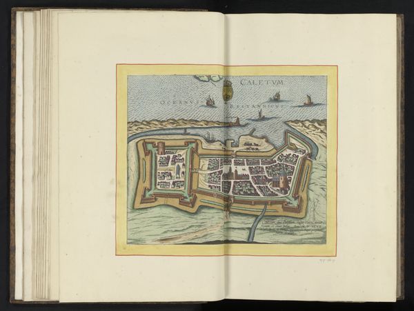
print, engraving
#
baroque
# print
#
geometric
#
cityscape
#
engraving
Dimensions: height 386 mm, width 494 mm
Copyright: Rijks Museum: Open Domain
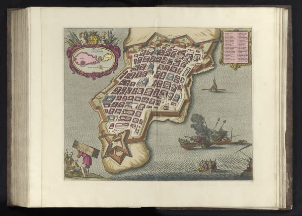
Curator: Look at this fantastic engraving—it's titled "Plattegrond van Cádiz," dating sometime between 1640 and 1706. It’s held here at the Rijksmuseum. What's your initial impression? Editor: The first thing that jumps out at me is how fragile it feels. It is as if you could turn the page, blow a breath and it crumbles like old parchment. The color palette really adds to that sense, so faded and time-worn. Curator: Indeed. Although produced via engraving, which allowed for multiples, it feels remarkably intimate. This piece shows a Baroque plan of the city, revealing a wealth of information about the geographical positioning of Cádiz in the 17th century. It strikes me that so many of the features represented, such as defense placements, are material considerations, but from a purely functional approach. Editor: I notice all the little ships depicted sailing by, so free despite the constraints of being drawn to fit the shape and purpose of this page. Does this plan suggest anything about the people? It isn’t necessarily trying to capture the essence of “Cádiz”. It is focused on something almost inhuman. Curator: Perhaps it implies power relations through land ownership, defensive strategies and so on. Look at the detailed city plan versus the relative plainness of the ocean. This reminds us about maritime control back in those times and how trade routes dictated fates. What I enjoy most is to see that a “map” or architectural plan can become an amazing artistic piece. Editor: True. By revealing such a clear relationship between geographic representation and colonial authority, it invites one to reconsider not only the making but also the uses of this map. It's a testament to how the tangible making, distribution, and use of even a "simple map" can serve much bigger aims and power constructs. I’m curious—what part of this work stands out the most for you? Curator: It’s the romantic idealism of portraying something utilitarian—the city plan itself—in such a beautiful, aesthetic manner that appeals to me most. The map takes me back to the age of merchant voyages. Editor: It really shows the value, both material and artistic, that objects like this held back then. A simple engraved document contains worlds!
Comments
No comments
Be the first to comment and join the conversation on the ultimate creative platform.
More like this