painting, acrylic-paint
#
painting
#
pattern
#
acrylic-paint
#
geometric pattern
#
abstract pattern
#
minimal pattern
#
organic pattern
#
geometric
#
flower pattern
#
repetition of pattern
#
vertical pattern
#
abstraction
#
pattern repetition
#
layered pattern
#
combined pattern
#
modernism
#
hard-edge-painting
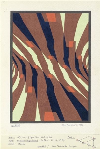
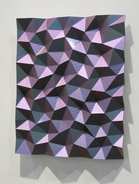
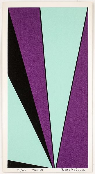
Copyright: Hans Hinterreiter,Fair Use
Hans Hinterreiter made Opus 52 with what looks like oil on canvas, but I can't say for sure when exactly. What strikes me is the way he's approached color – like he's building up a structure, piece by piece. I wonder how he mixed those hues, a pale sage, a muted, terracotta, and a deep, almost bruised purple and what they mean for the composition? The paint application is so smooth, it almost looks airbrushed, no visible brushstrokes. It's like he wants to erase the hand of the artist and let the colors and shapes do all the talking. See how the triangular shapes interlock, creating a kind of kaleidoscopic effect, a sense of movement and depth. It's like looking into a strange, geometric garden. You might see echoes of Josef Albers' color studies here, or even some Op Art pioneers, but Hinterreiter's got his own thing going on. It's controlled, but not cold and I'm here for it.
Comments
No comments
Be the first to comment and join the conversation on the ultimate creative platform.
More like this