Copyright: Rijks Museum: Open Domain
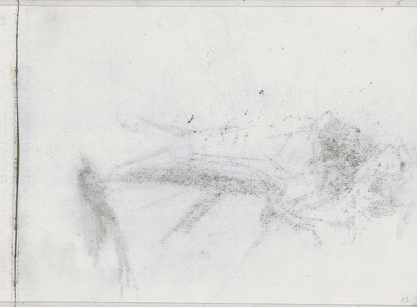
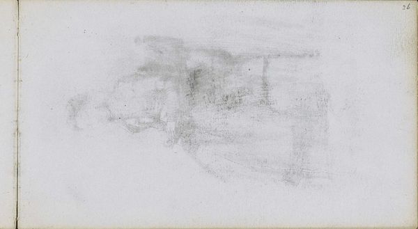
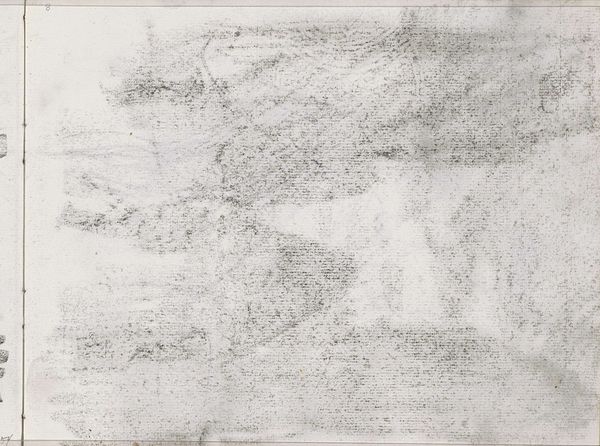
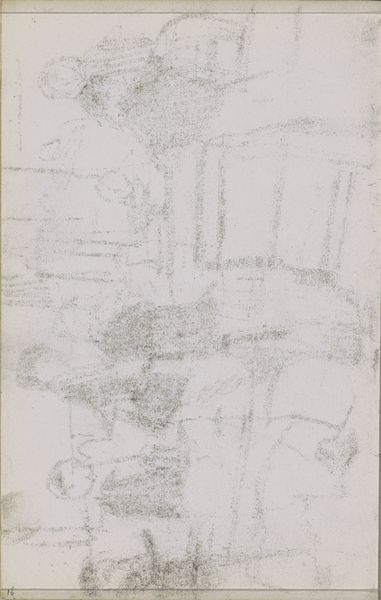
Editor: This is Isaac Israels' "Abklatsch van de krijttekening op blad 21 verso," made between 1875 and 1934. It's a drawing done in pencil and graphite, currently housed in the Rijksmuseum. It strikes me as incredibly delicate, almost ephemeral in its execution. What catches your eye in terms of its structure? Curator: Immediately, the dynamism of line becomes apparent. Observe how Israels employs varying pressure to articulate form, moving from barely-there wisps to areas of dense, almost chaotic scribbling. These heavier patches, situated predominantly on the right, serve as a tonal anchor, a visual counterweight to the lighter, more ethereal qualities dominating the composition's left quadrant. Consider, how does this use of contrasting densities shape our perception? Editor: It does give a sense of depth and weight. The contrast between the defined and undefined creates visual interest, and suggests maybe movement, or even a passage of time within a single image? Curator: Precisely. It presents us with an image pregnant with potential. What strikes me is the near abstraction achieved despite the clearly figural suggestions. The pencil, rather than defining with crisp boundaries, operates more sculpturally. He allows the medium itself to generate form and atmosphere. This approach prefigures a lot of the modernist ethos, wouldn’t you agree? Editor: Definitely, now that you point it out. I hadn't considered its modernist implications so explicitly, but seeing the interplay of form and medium as the primary focus makes it clearer. Thank you for the illuminating analysis. Curator: My pleasure. Appreciating its formal mechanics really unlocks further potential in it.
Comments
No comments
Be the first to comment and join the conversation on the ultimate creative platform.
More like this