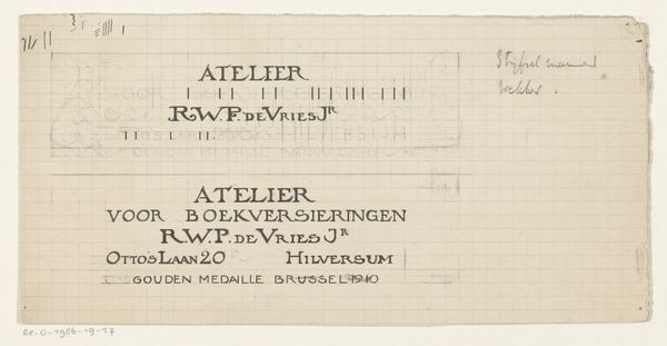
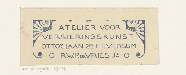
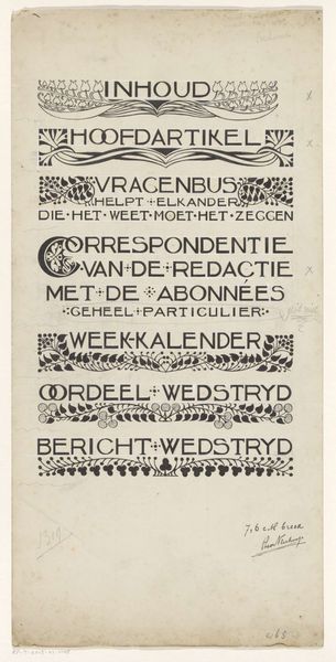
Ontwerp voor een reclame voor R.W.P. de Vries Jr. te Edam 1884 - 1952
0:00
0:00

drawing, graphic-art, paper, typography, ink, poster
#
drawing
#
graphic-art
#
art-nouveau
#
paper
#
typography
#
ink
#
poster
Dimensions: height 228 mm, width 126 mm
Copyright: Rijks Museum: Open Domain
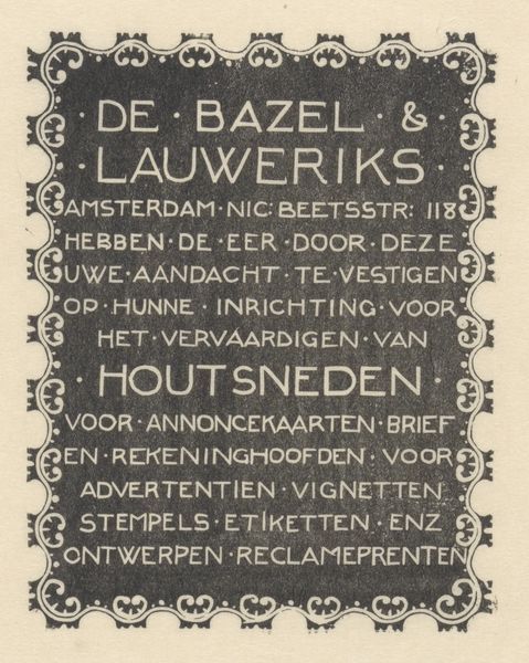
This is a promotional design for R.W.P. de Vries Jr. in Edam, made with ink on paper. It’s an advert, but the graphic quality is what grabs me: the handmade lettering and the way the text itself becomes a set of marks. I think about how an image comes together through layers of intention and chance. Here the solid blacks and open whites create a striking visual rhythm. Look how the frame is built from these jagged, almost gothic forms, echoing the list of book-related services. It's like the frame is a visual poem, each element carefully considered, yet there's a raw, immediate quality, a sense of directness that I find so appealing. The whole thing reminds me of the early work of someone like Emil Ruder, where typography becomes image. It’s this back-and-forth between representation and abstraction that makes art so endlessly fascinating. There's no single answer, just the ongoing conversation.
Comments
No comments
Be the first to comment and join the conversation on the ultimate creative platform.
 Collect
 React
React Comment
More like this