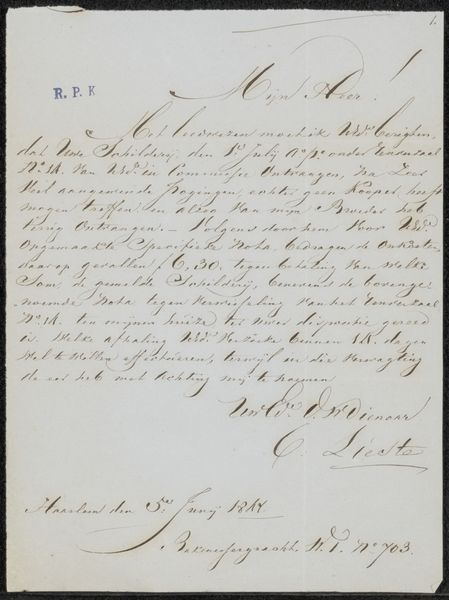
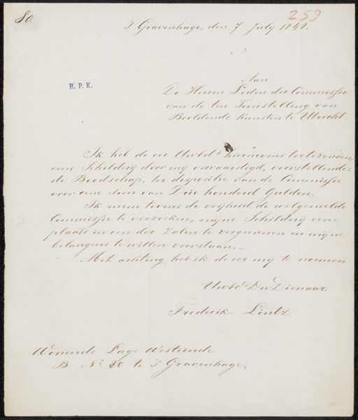
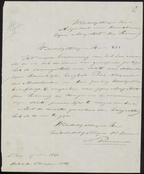
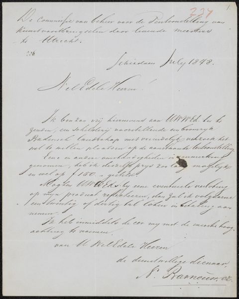
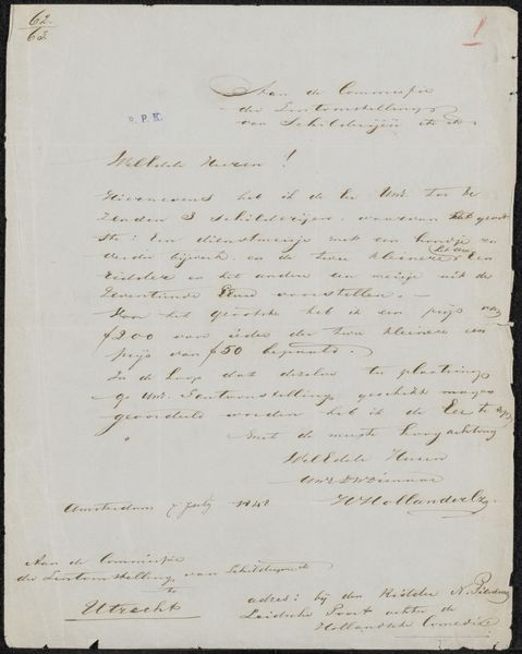
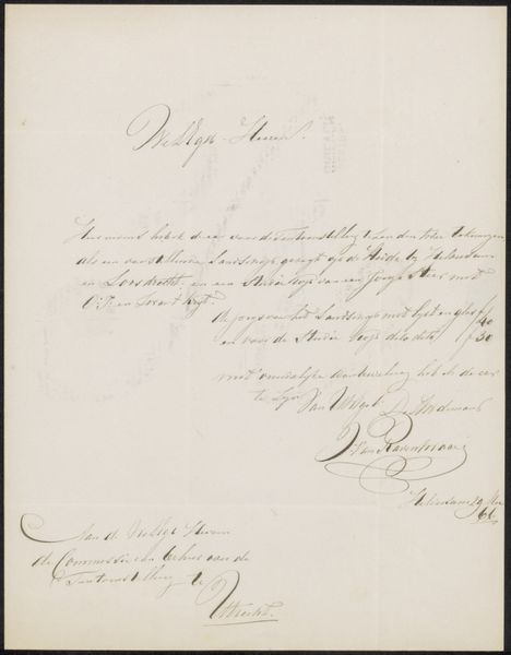
Brief aan de commissie van de Tentoonstelling van Levende Meesters in Utrecht Possibly 1848
0:00
0:00
drawing, paper, ink
#
portrait
#
drawing
#
aged paper
#
toned paper
#
dutch-golden-age
#
ink paper printed
#
hand drawn type
#
paper
#
personal sketchbook
#
ink
#
fading type
#
ink colored
#
sketchbook drawing
#
sketchbook art
#
calligraphy
Copyright: Rijks Museum: Open Domain
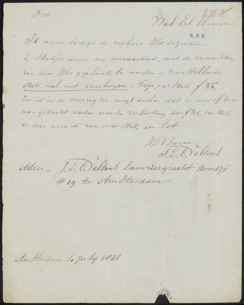
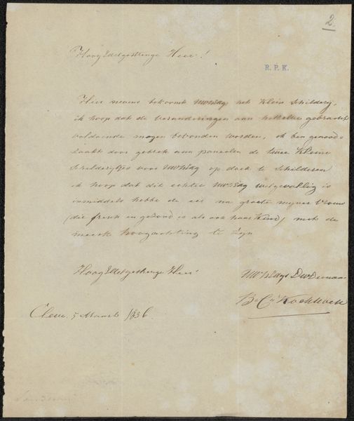
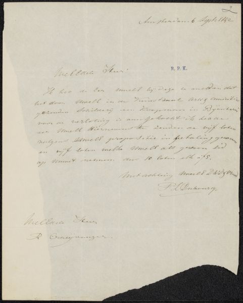
Curator: Here we have something quite delicate: "Brief aan de commissie van de Tentoonstelling van Levende Meesters in Utrecht," which translates to "Letter to the Committee of the Exhibition of Living Masters in Utrecht." Attributed to Johannes Verhoogh and possibly dating back to 1848, it's ink on paper, displaying beautiful handwriting. What springs to mind for you? Editor: It feels incredibly intimate. Almost like sneaking a peek into someone’s private correspondence. There’s a fragility to it, emphasized by the aged, toned paper and the faded ink. Like holding a whisper from the past. Curator: Exactly! The handwritten quality immediately pulls us in. Notice the graceful flow of the calligraphy, each stroke imbued with personality. Calligraphy wasn't just about communication; it was about imbuing writing with artistic expression. Editor: It's the imperfections, too. The slight unevenness in the letters, the subtle variations in the ink pressure. Those little flaws give it so much character. Mass-produced text lacks this sort of tangible human touch. What can you say about the cultural context of letters and handwriting in this period? Curator: Absolutely. In that era, handwriting reflected one's education and social standing. The letter form itself served as a cultural ritual, often imbued with symbolic meaning depending on the occasion, tone, and recipient. The language used here is formal, respectful. This suggests a certain protocol and decorum were meticulously observed. Editor: I find myself imagining the artist sitting down with his pen, carefully choosing his words, conscious of the impression he wanted to make. What I also love is how this piece seems to blur the lines between art and document, personal expression and historical record. Curator: That duality is compelling. This letter gives insight into the art world of the mid-19th century Netherlands, shedding light on how artists sought recognition. Editor: So, more than just ink on paper; it’s a portal to another time, to the hopes and anxieties of an artist seeking his place in the world. It feels wonderfully melancholic. Curator: A sentiment that beautifully encapsulates the enduring appeal of this piece. The blending of artistry and communication preserves a uniquely historical echo.
Comments
No comments
Be the first to comment and join the conversation on the ultimate creative platform.
More like this