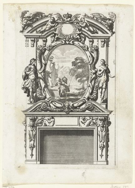
engraving
#
baroque
#
line
#
history-painting
#
engraving
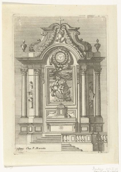
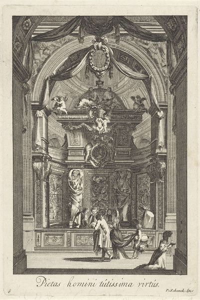
Dimensions: height 170 mm, width 140 mm
Copyright: Rijks Museum: Open Domain
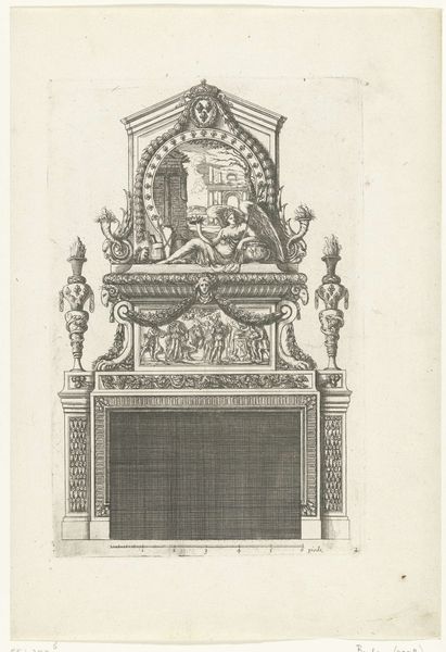
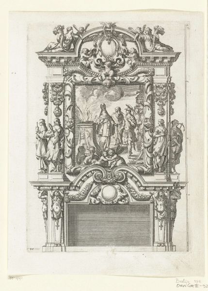
Editor: We're looking at "Altaar opgericht door de predikheren, 1685," an engraving by Gaspar Bouttats, here at the Rijksmuseum. It's incredibly detailed. All those lines create so much depth and texture. What jumps out at you about the structure and composition of this altar? Curator: Immediately, one notices the hierarchical organization. Observe how the lower scene, enclosed by the arch, supports a smaller scene above. This upward progression directs the eye, and thereby implies an order of importance. The symmetry is broken only slightly, drawing us to question those very deviations. Editor: You mean like the figures in the lower register being asymmetrical under the symmetrical archways? Curator: Precisely. The careful imbalance creates dynamism. But consider also the strategic deployment of line itself. Look how Bouttats uses hatching and cross-hatching not merely to model form but to delineate different spatial planes. Note the density of lines defining the figures in the lower register. What effect does this contrast achieve? Editor: It really pushes them forward, emphasizing the human drama and emotion happening in that lower scene compared to the cleaner, simpler upper scene. It makes the figures more tactile. So, it's not just representational, it’s about emphasizing certain themes? Curator: Indeed. The manipulation of line, the orchestration of symmetry and asymmetry - all are consciously employed strategies which shape the viewer's understanding of space and narrative within the altar’s architecture. A pure and strategic rendering in black and white. Editor: I hadn't noticed how much the technique adds to the story. Thanks! Curator: A valuable reminder that technique is never merely technical. It is integral to the artwork’s intended message and aesthetic power.
Comments
No comments
Be the first to comment and join the conversation on the ultimate creative platform.
More like this