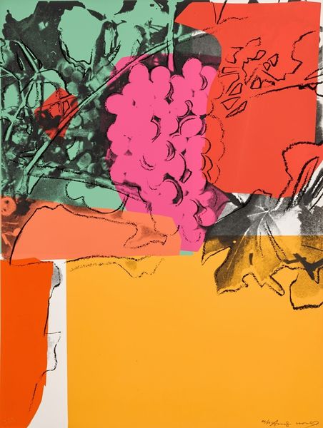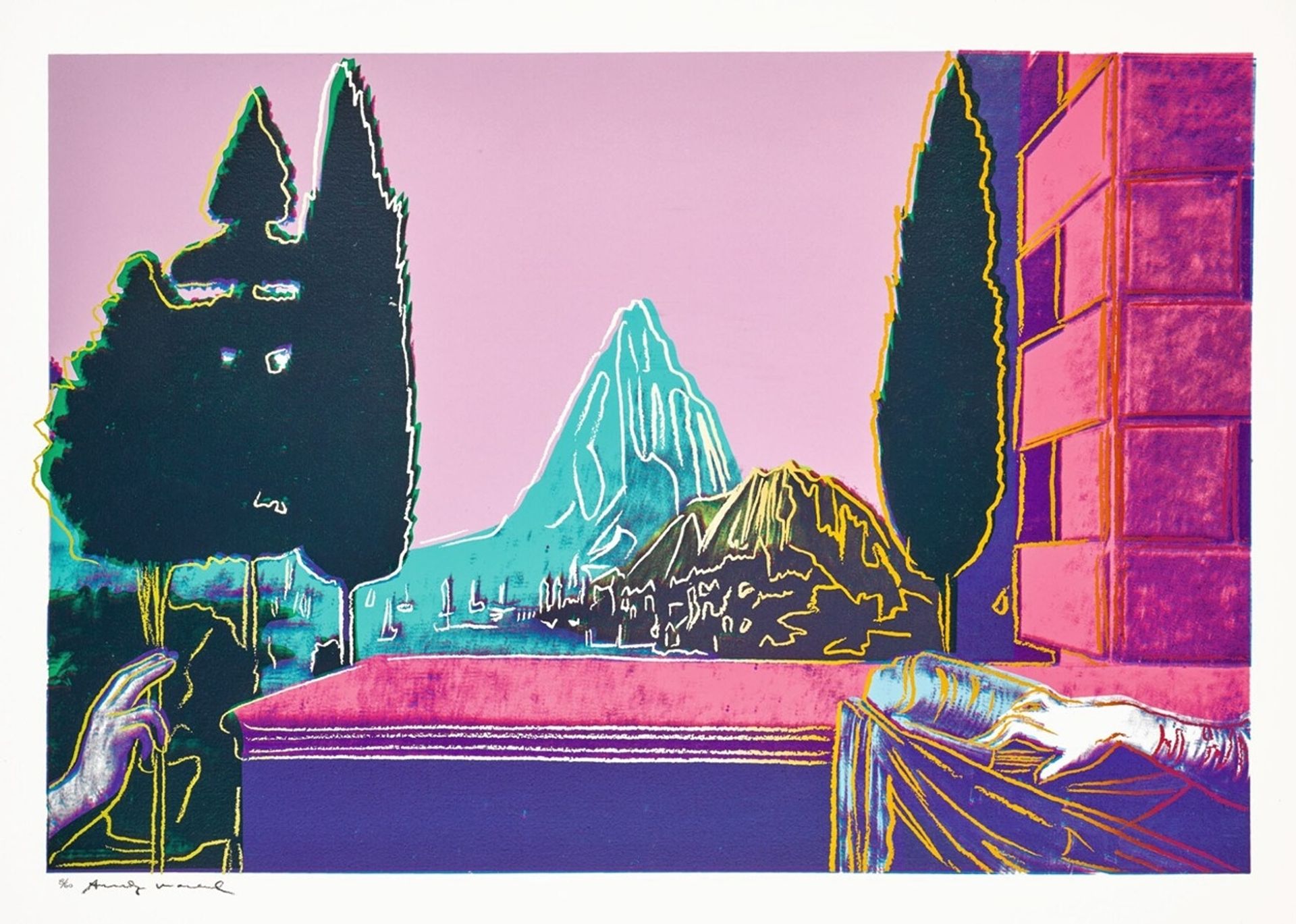
1984
Details Of Renaissance Paintings
Listen to curator's interpretation
Curatorial notes
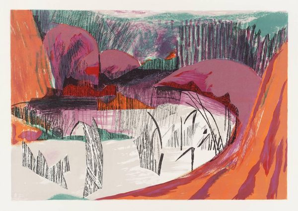
Editor: This print, "Details Of Renaissance Paintings" by Andy Warhol, made in 1984 using screenprint and acrylic, presents a rather dreamlike vision. It's unexpected – the colors feel like a hazy memory of a grand Italian landscape, maybe seen on a postcard. What stands out to you when you look at this? Curator: Ah, Warhol taking on the Renaissance. It's like seeing Marilyn Monroe dressed as Mona Lisa! Appropriation, of course, was a huge part of his game, turning high art into… well, high pop. But there's more to it than meets the eye, I think. Do you notice how he flattens everything, stripping away the depth, almost mocking the very idea of the 'sublime' landscape? Editor: That's interesting! So, it’s less about honoring the Renaissance and more about… dissecting it? Curator: Precisely. It's as if he's saying, "Even these masterpieces are just commodities, ripe for reproduction and consumption." Look at the electric pink sky; it's not exactly atmospheric perspective, is it? But is that such a bad thing? It certainly makes the image grab you by the eyeballs. I find his use of acid colour quite witty, to be honest, even subversive, as though it is punking its predecessor Editor: So it's not just pretty colours – they're making a statement. I came here with an art history assignment, but you’ve opened my eyes to looking at this a whole different way. I wasn't expecting irony from a landscape! Curator: Wonderful. Maybe next time you could show me something and allow me to get all the meanings twisted…and make new friends.