
1647
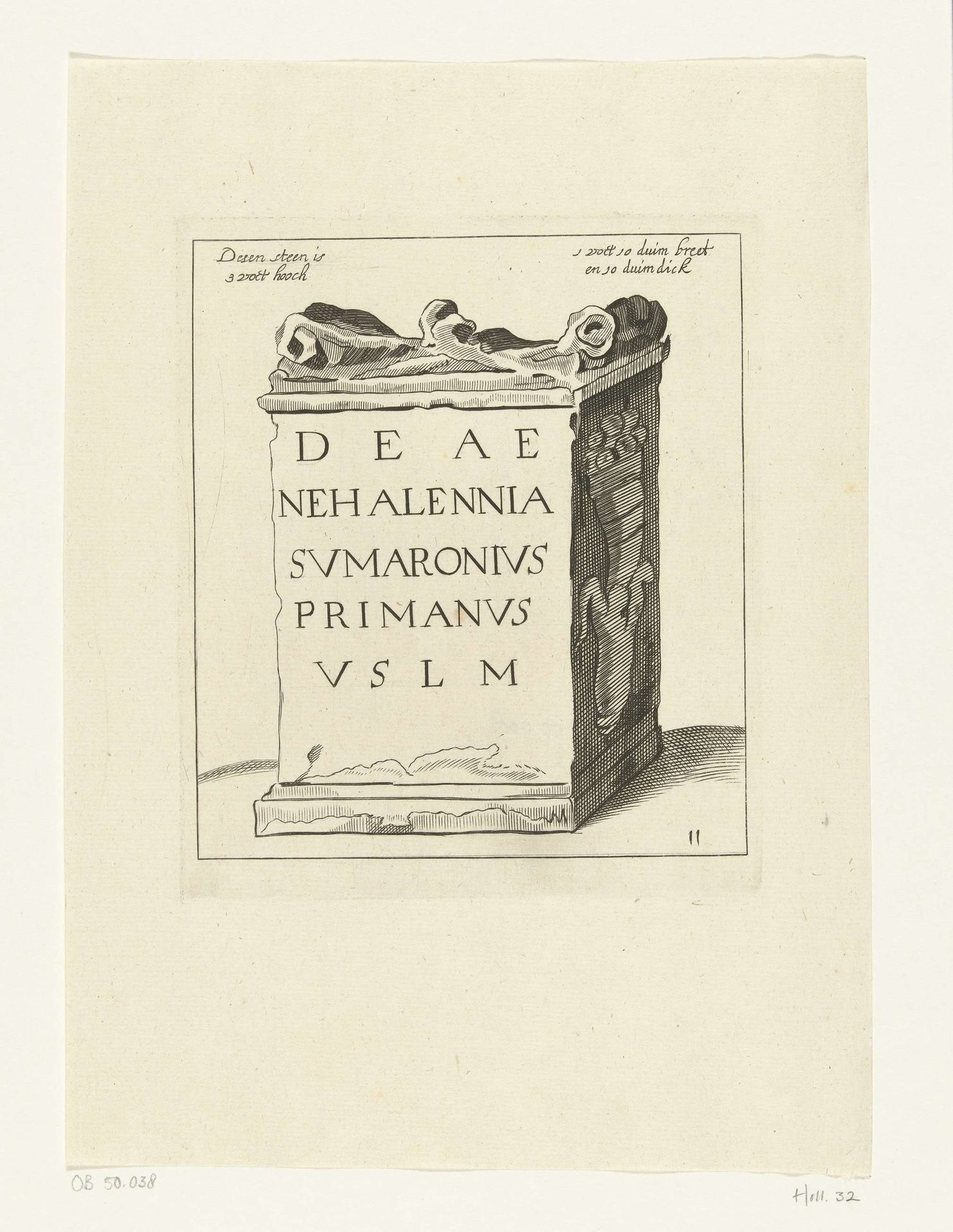
Voetstuk van een Nehalennia-altaar

Listen to curator's interpretation
Curatorial notes
Editor: This engraving, "Voetstuk van een Nehalennia-altaar," is dated 1647, and made by Hendrick Danckerts. The stark geometric forms and inscription give it a really severe, almost solemn mood, wouldn't you say? How would you interpret this work from a formalist approach? Curator: Its starkness, as you aptly note, arises directly from the print medium itself, the unforgiving line of the metal engraving. The contrast between light and shadow isn't merely representational; it's structural. Observe how the artist uses hatching to build volume and delineate form. Where does your eye first travel? Editor: Definitely to the inscription itself. The letters are so large and centrally placed. Curator: Precisely. The inscription becomes a dominant visual element. What do you make of its relationship to the sculpted elements? Does the symmetry suggest any relationship? Editor: It's… deliberate. The symmetry emphasizes the solidity of the altar, suggesting permanence. Yet the wear and tear conveyed through the engraving's line create a sense of age and history. Is that a contradiction? Curator: Not at all. The contradiction is a productive tension. This meticulous record embodies its subject through visual structure: line, form, the relationship between text and image, the tension between decay and idealized form. Through these formal elements, what do we glean? Editor: That the piece is just as much about visual balance and representation as it is the altar itself, maybe even moreso. I hadn’t considered how much the medium itself was doing the meaning-making here!