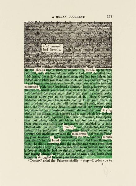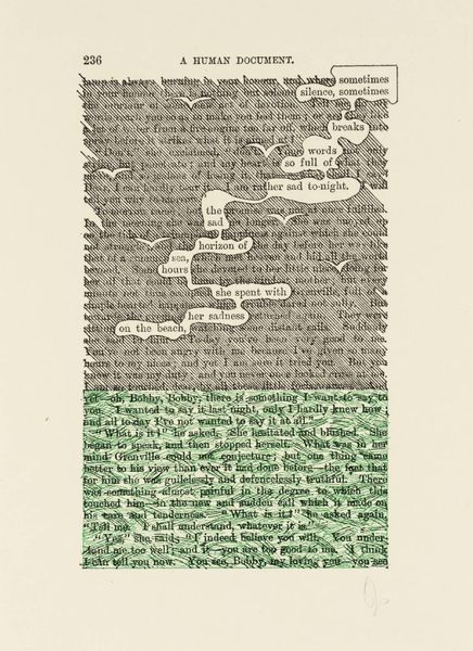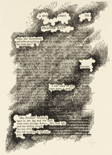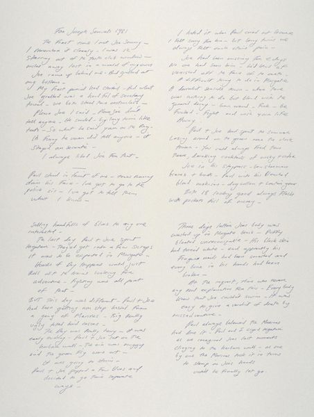
Curatorial notes
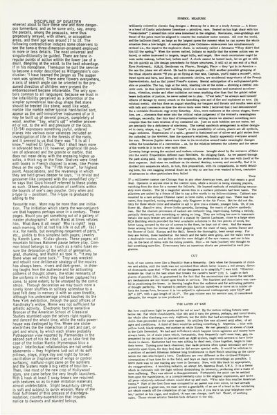
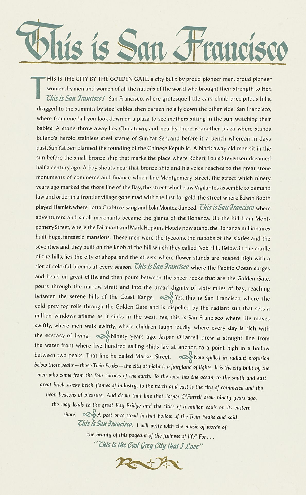
S. Tate made "Japanese Peace Conference: San Francisco" sometime in the 20th century with ink on paper, and the olive-green ink feels very deliberate against the parchment-like background. It has this sense of the past, like looking at a historical document. The texture of the paper is smooth, and the text is carefully laid out, almost like a calligraphic map. If you look closely at the ornate letters, they evoke a sense of nostalgia, like the title cards you see at the beginning of old movies. The whole piece creates a kind of imagined San Francisco, a landscape of memory. It’s not just about what’s there, but what’s remembered, what’s been told and retold. This piece reminds me of the work of Ed Ruscha, who uses text in a similar way. Both artists play with the relationship between language and image, inviting us to see the world in a new way, where words become pictures and pictures tell stories. In art there's always this conversation happening, this exchange of ideas.