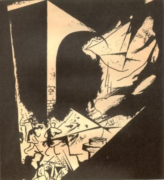
mixed-media, poster
#
portrait
#
cubism
#
mixed-media
#
figuration
#
text
#
watercolour illustration
#
cartoon style
#
poster
#
surrealism
Copyright: Public domain
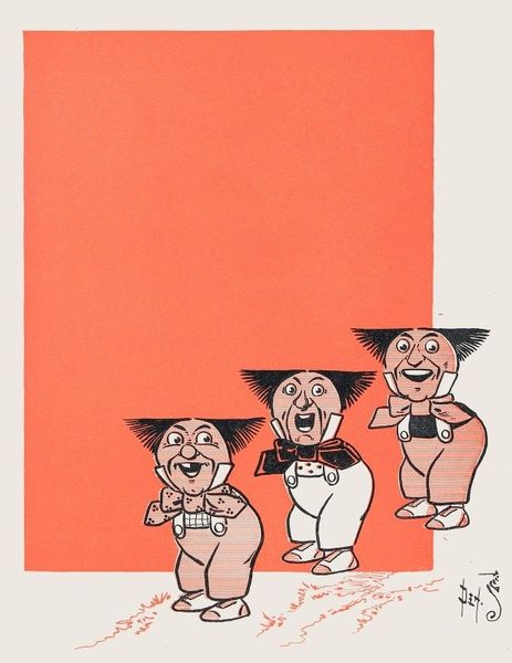
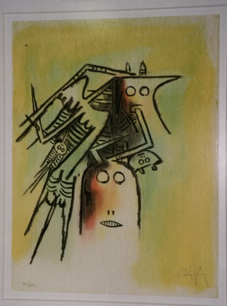
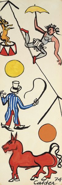
Editor: This is Jindrich Styrsky’s cover for Pestr Květy Magazine, titled Cirkus, made with mixed media as a poster. It strikes me as…unsettling, mostly because of the figures' bizarre expressions and disproportional forms. What elements do you find most visually compelling? Curator: The dynamism of composition captivates. Consider the interplay of geometric forms – the implied circles of the clown faces against the angularity of the tightrope and net. Observe how Styrsky orchestrates color; the vibrant reds and yellows contrast sharply with the somber background, creating a push and pull, which forces the eye to dart across the surface, does it not? Editor: I do see what you mean by the geometric forms. But what's the purpose of contrasting these simple shapes? Curator: Semiotically, simple geometric shapes represent primary concepts or essential building blocks of an idea, especially regarding cubism and surrealism; therefore, this emphasizes the raw construction of Styrsky's intended circus narrative. Furthermore, his color choices amplify it – the color acts as a primal, emotive signifier. Don’t you see the unsettling emotional undercurrent emerging from these juxtapositions? Editor: Now that you mention it, the primary color contrast seems very bold. Thank you for pointing out those visual tensions within the structure! Curator: My pleasure. Deconstructing these formal choices offers deeper understanding. It's through careful, repeated observation that we start to decode it.
Comments
No comments
Be the first to comment and join the conversation on the ultimate creative platform.
More like this