graphic-art, print, linocut, poster
#
graphic-art
#
art-nouveau
#
linocut
# print
#
linocut
#
figuration
#
linocut print
#
cityscape
#
poster
Copyright: Public domain
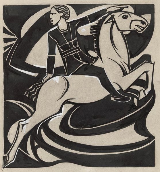
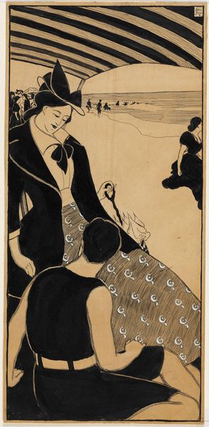
Curator: Here we have Alfred Roller’s "Sketch to a Poster" from 1898. What are your initial thoughts? Editor: I'm struck by the dynamism of it. The strong diagonal lines, the implied motion of the cyclist—it’s instantly engaging. There’s a raw energy conveyed through the linocut medium itself. Curator: Indeed. Roller was quite intentional with his use of form here. Note the simplification of shapes; the figure of the cyclist, almost monumental in its stylization, occupies a powerful space. Semiotically, the flatness reinforces its graphic function. Editor: It speaks to the burgeoning cycling craze of the late 19th century and its impact on society. It was so new; women began cycling too, expanding personal freedoms—and the artist portrays an empowered modern female! What's “Belbif”? Was it a cycling company of the time? Curator: The relationship of text to image also presents an interplay. "Belbif" at the upper register and "Fahrrad," the German term for "bicycle," located on the bottom anchors and punctuates the central dynamic movement. The contrasting black ink used on the biker against the reddish background emphasizes her powerful silhouette. Editor: The textural variations are intriguing too. Notice the hatched background; they introduce a sense of spatial depth, but also add an expressive layer to this work. Was this kind of flat illustration technique common to the poster images in 1898? Curator: Absolutely, that visual language directly connects to concurrent currents of Art Nouveau, the style very current during that time. In some sense, we can almost consider the artwork to be celebrating modernity while simultaneously questioning conventional representation and celebrating flatness. Editor: So, beyond being an advertisement, it becomes a statement on visual communication. The limited color palette makes it accessible for mass production of print while also ensuring that her message remains unambiguous. It captures a very pivotal cultural shift through both form and subject matter. Curator: It’s precisely that intersection of aesthetics and functionality, that is really key for our understanding of the work’s importance in a time of technological advancements. Editor: Ultimately, it speaks to the evolving status of women through design during a critical period. Curator: Indeed, a beautiful fusion of form and function.
Comments
No comments
Be the first to comment and join the conversation on the ultimate creative platform.
More like this