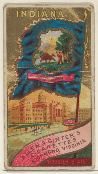
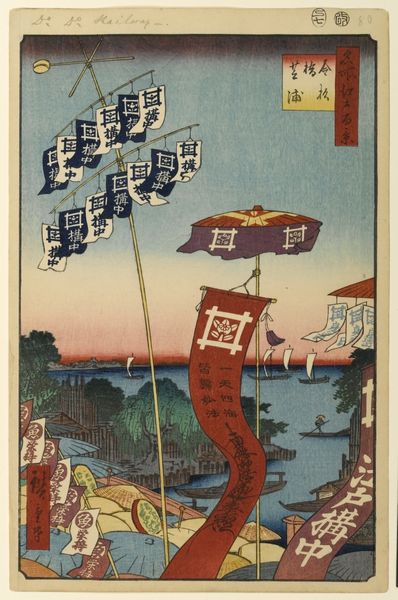
graphic-art, print, poster
graphic-art
art-nouveau
landscape
river
cityscape
poster
Dimensions: height 1295 mm, width 710 mm
Copyright: Rijks Museum: Open Domain
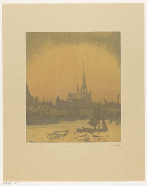
This poster promoting tourism in Nijmegen, by W. van Boven, uses flat planes of colour and bold outlines. It reminds me that artmaking is as much about what you leave out as what you put in. The artist simplifies forms to their essence, kind of like writing a haiku. Look at the red sky! It's not trying to be realistic, but it captures the drama of a sunset. The colors are bold and graphic, making the scene feel like a stage set, which I really like. The way the boats are rendered, they are just silhouettes, but they create depth and movement in the water. And those tiny waves? Perfect. This poster reminds me of early 20th-century printmakers like Félix Vallotton. There's a similar love of strong lines and simplified forms. Ultimately, it shows us that art can be about suggestion and implication, inviting us to fill in the gaps with our imaginations.
Comments
No comments
Be the first to comment and join the conversation on the ultimate creative platform.