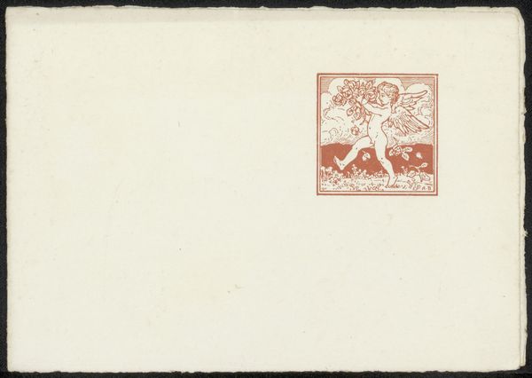
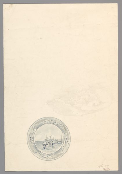
Reclamekaart voor hotel-restaurant Corvin te Hilversum 1884 - 1952
0:00
0:00
graphic-art, print, typography, poster
#
graphic-art
# print
#
typography
#
poster
Dimensions: height 121 mm, width 170 mm, width 338 mm
Copyright: Rijks Museum: Open Domain
Editor: So, here we have an advertising card, "Reclamekaart voor hotel-restaurant Corvin te Hilversum," dating roughly from 1884 to 1952. It's a print by Reinier Willem Petrus de Vries. It’s striking in its sparseness, a sort of quiet announcement. How would you interpret the image within its historical context? Curator: The near-blankness is quite interesting. It prompts us to consider the social dynamics at play. What did such restrained advertising signal to its intended audience? What notions of class or sophistication did it try to appeal to, especially in a society grappling with evolving ideas about labor and leisure during this period? The typographical choices, that font – what does it evoke for you? Editor: It feels formal, classic…maybe a little exclusionary? Like it’s not meant for everyone. Curator: Exactly. It invites us to examine the artwork not just for its aesthetic qualities but as an active participant in constructing social hierarchies. This card normalizes and naturalizes privilege by presenting an exclusive space. Editor: It makes me think about who had access to leisure and travel during that time. And who was excluded. Was this artist aware of that division, or were they simply replicating existing norms? Curator: A vital question! The artist's intent might be less relevant than the impact the artwork has in perpetuating, or perhaps subtly questioning, the status quo. How do you see the design reinforcing the power dynamics of that era? Editor: The use of so much empty space seems like a power statement, almost suggesting the hotel's reputation precedes it. Curator: Precisely. And in contemporary theory, we often see this kind of quiet assertion of dominance examined. It makes us think about whose stories are being told, and whose are being deliberately left out of the frame. I think this work encapsulates many issues that can make us think about it more deeply. Editor: That's really shifted my perspective. I was initially drawn to the simplicity, but now I see the advertising card embodies much more! Thanks for unraveling it.
Comments
No comments
Be the first to comment and join the conversation on the ultimate creative platform.
More like this