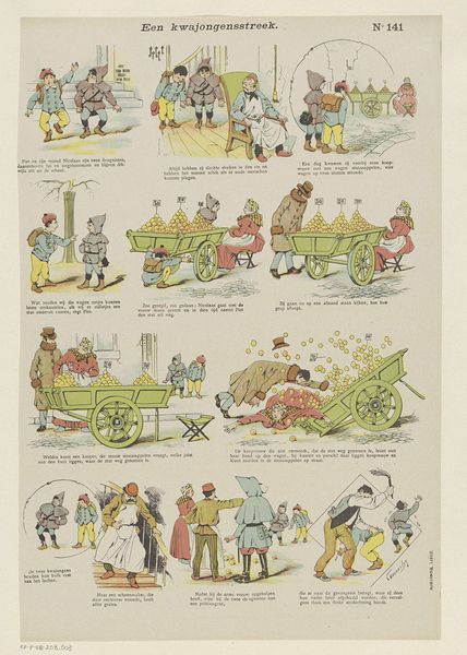
1894 - 1959
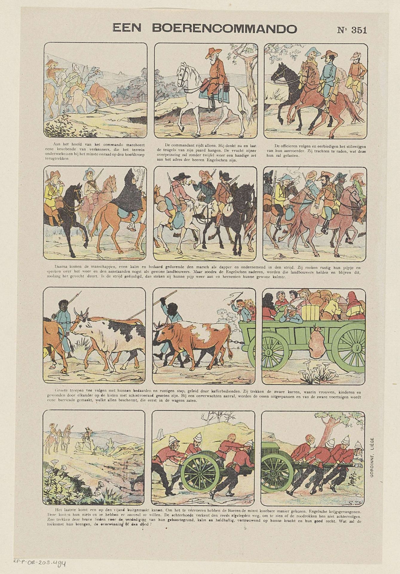
Een boerencommando
Listen to curator's interpretation
Curatorial notes
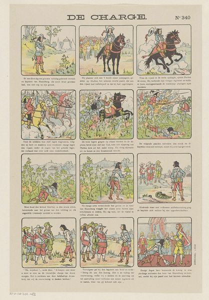
Editor: We're looking at "Een boerencommando," or "A farmer commando," a graphic print by Monogrammist G.J., likely created between 1894 and 1959. It's a comic strip depicting figures on horseback, people leading oxen, and soldiers. I am immediately struck by the rigid, formal structure imposed by the panels. What do you see in the way the composition and the sequencing of panels tells the story? Curator: Indeed, the rigid grid structure dictates how we "read" the sequence. Notice the stark contrast between the first two registers where the composition relies heavily on lines indicating movement, and the lower ones which compress figures in the center. Editor: What would be the significance of that stylistic decision? Curator: If we analyze the individual panels as visual units, we notice several diagonal lines, whether formed by bodies, landscapes, or roads. These not only infuse dynamism, but also subtly direct our gaze. Observe also the interplay between color and negative space. How do they impact our perception of the narrative progression? Editor: The bright colors definitely add a sort of lightness to some quite heavy subjects like war. Curator: Precisely. The simplification of forms, the reliance on distinct outlines, contributes to the narrative clarity while arguably sacrificing some emotional depth. The question remains: how might this conscious aesthetic choice relate to the work's function and purpose within its historical context? Editor: That’s something to keep in mind while further researching the work and the artist, to understand more the cultural milieu they come from! I had not previously thought that so much narrative analysis could be accomplished through visual and formal strategies.