drawing, ink, pen
#
portrait
#
drawing
#
comic strip sketch
#
pen sketch
#
personal sketchbook
#
ink
#
idea generation sketch
#
sketchwork
#
ink drawing experimentation
#
pen-ink sketch
#
sketchbook drawing
#
pen
#
storyboard and sketchbook work
#
sketchbook art
Copyright: Rijks Museum: Open Domain
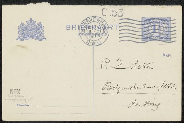
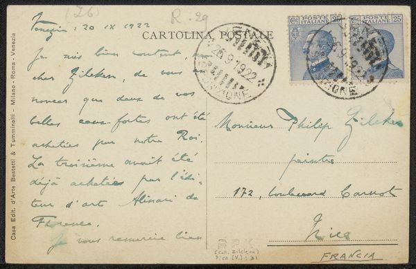
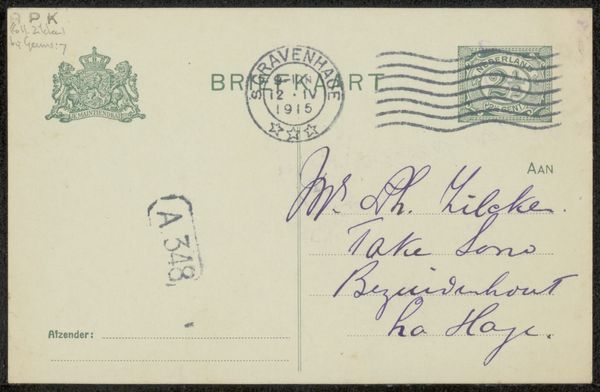
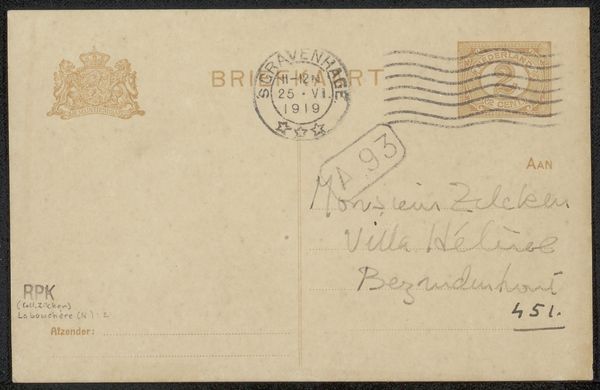
Editor: Here we have "Briefkaart aan Jan Veth" (Postcard to Jan Veth), possibly created between 1922 and 1930 by Willy Sluiter. It’s an ink drawing on paper, a simple sketch, but I'm immediately drawn to the calligraphic quality of the handwriting. What elements do you find most compelling in this work? Curator: The handwriting is, indeed, noteworthy. Observe how the line varies in thickness, creating a rhythm across the surface. The composition is particularly intriguing. We have a careful balance between the postal markings and the written address. Consider the weight given to the sender's address compared to the recipient's—the intentionality in this contrast shapes the viewer’s attention. Editor: I hadn't considered the contrasting weight of the script before! How would you say that contrast affects the meaning, or interpretation, of the piece? Curator: The structural contrast introduces a tension between formality and informality. The formal postal markings speak to its functionality, its life as a mode of conveying a message; conversely, the personal script allows an appreciation of gesture and style. Consider, too, how the visual elements – the stamps, seals, and text – are distributed; is there a hierarchy at play? Does any element overpower another or is there harmony across all compositional elements? Editor: I see what you mean. It's fascinating how such simple choices can create such visual complexity. Curator: Precisely. And the materiality of the ink itself—its varying opacity and texture—contributes to the richness of the overall experience, moving it away from a merely functional purpose. Note how even the imperfections become intrinsic to the piece's aesthetic quality. Editor: So, paying attention to the artistic elements and materials gives us a new perspective. It highlights Sluiter's sensitivity in turning the mundane into an art form. Thanks for that! Curator: Indeed. Focusing on those aspects can provide surprisingly rich insight. My pleasure.
Comments
No comments
Be the first to comment and join the conversation on the ultimate creative platform.
More like this