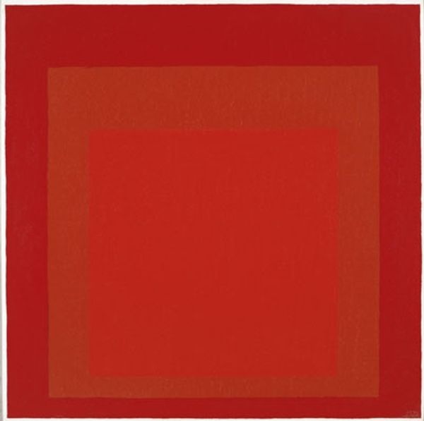
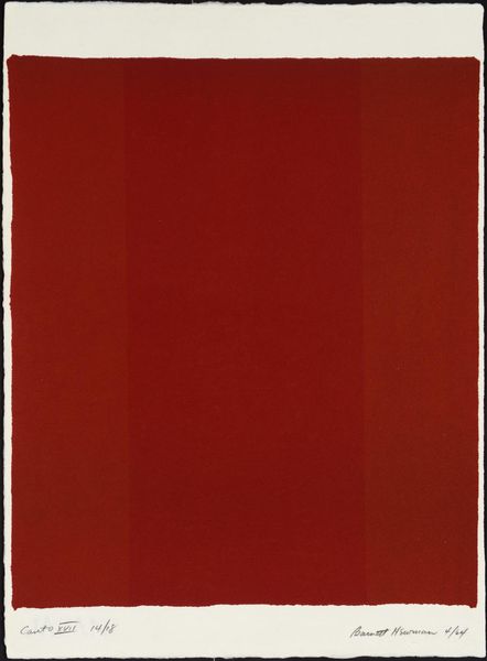
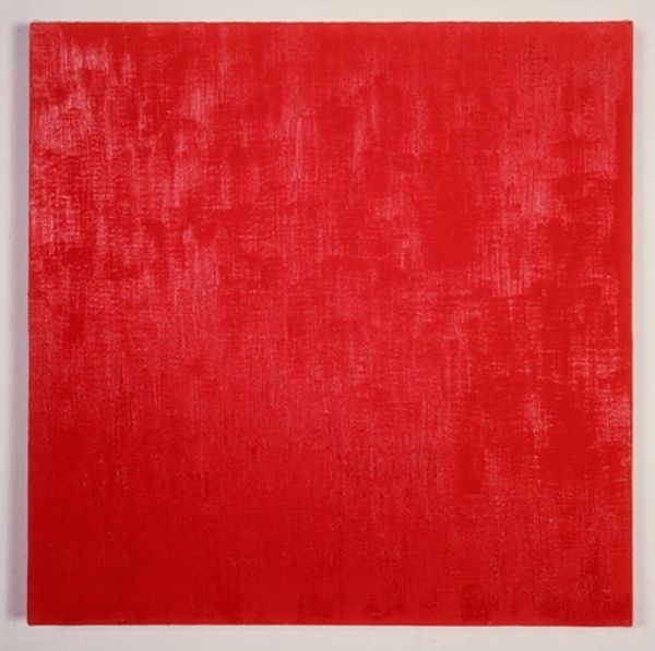
Homage to the Square: Broad Call 1967
0:00
0:00
josefalbers
Museum of Modern Art (MoMA), New York City, NY, US
painting, acrylic-paint
#
op-art
#
painting
#
minimalism
#
colour-field-painting
#
acrylic-paint
#
geometric
#
abstraction
#
modernism
#
hard-edge-painting
#
monochrome
Dimensions: 121.9 x 121.9 cm
Copyright: Josef Albers,Fair Use
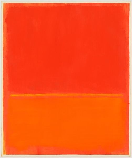
Curator: Standing here before Josef Albers' "Homage to the Square: Broad Call" from 1967, painted with acrylic on board, what strikes you first? Editor: It vibrates! The different reds are so close, but they seem to push and pull. It's like staring into the heart of a flame – simple, yet complex. Curator: Albers dedicated much of his career to this series. He aimed to explore how colors interact, to show their relativity based on context and placement. It wasn't just about the color itself, but what it did next to another. Editor: That makes sense, because there is a fascinating tension at play. You have this incredibly strict geometry with the nested squares, and this lush almost visceral sense of warmth radiating from the canvas. It's oddly compelling, wouldn't you say? Almost meditative in its impact, even? Curator: Absolutely. In a post-war art world leaning into grand gestures and dramatic expression, Albers quietly investigates the psychology of color. "Homage to the Square" challenged conventions around subjectivity by focusing on universal visual principles. The work's display in museums elevates such questions above traditional art experience. Editor: But surely it does evoke an emotional response for most viewers! It's impossible, in my view, to stand here and *not* feel something stir inside. For me, it’s a warmth that extends outwards, which, paradoxically, invites a feeling of interiority and contemplation. I suspect this accessibility contributed greatly to its enduring appeal. Curator: Possibly, though much of the work's initial reception hinged on its radical reduction. Many critics and artists were bewildered, even dismissive of his method. To them, this piece presented an unsettling austerity, rather than accessibility. Editor: I find it interesting that an artist so involved in stripping down imagery would, ultimately, provide me, as a viewer, a deeply imaginative and almost spiritual space. It's a bold reminder to truly observe what's in front of us, even if that something appears as a single color. Curator: Indeed. Viewing "Broad Call" through a historical lens teaches us that simplicity is hardly simple; it can serve as both artistic intervention and subtle visual activism. Editor: Thanks for sharing this illuminating perspective! It's wonderful how Albers transforms the most simple composition into a fascinating world of colors.
Comments
No comments
Be the first to comment and join the conversation on the ultimate creative platform.
More like this