Copyright: Antonio Corpora,Fair Use
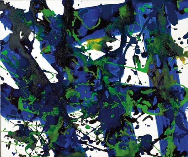
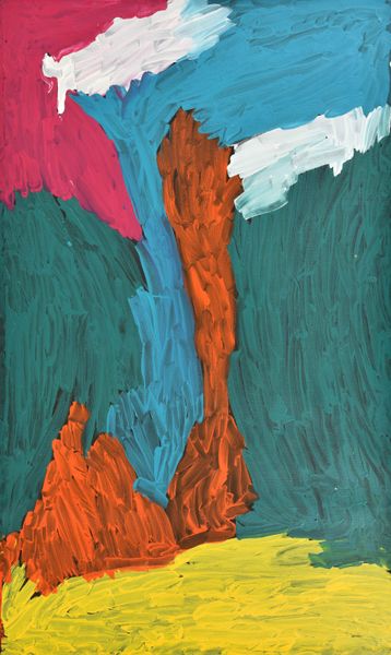
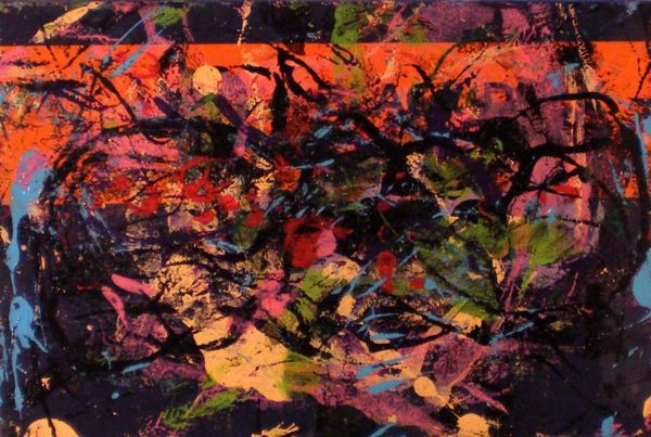
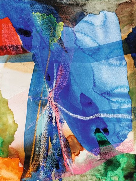
Editor: Here we have Antonio Corpora's 1973 work, *Il vento blu,* made with acrylic paint. The energetic lines of orange and green really pop against the deep blue background. It feels almost like a coded message to me. What do you see in this piece? Curator: I see a dialogue between concealment and revelation. Blue, the colour of the subconscious, attempts to obscure, yet those sharp green and vibrant orange markings fight for visibility. Do you notice how they aren't just randomly placed? Editor: Now that you mention it, they almost seem like traces of something else, peeking through a screen. Are they meant to symbolize something specific, or is it more about the feeling? Curator: Consider that blue often signifies fidelity, stability. What happens when such steadfastness is disrupted? Does it alter the message we perceive or merely colour our understanding? I believe Corpora invites us to question this. Perhaps those slashes represent memories trying to surface. Editor: So, even in abstraction, there's a cultural weight behind these colors and shapes? Curator: Absolutely. Even seemingly spontaneous gestures build on layers of accumulated meaning. It's fascinating how colour can hold emotional power across generations. Editor: That gives me a lot to think about in terms of how abstract art communicates meaning! Curator: Indeed. It is less about what is literally depicted, and more about how we interpret those visual cues through a lens of cultural memory.
Comments
No comments
Be the first to comment and join the conversation on the ultimate creative platform.
More like this