About this artwork
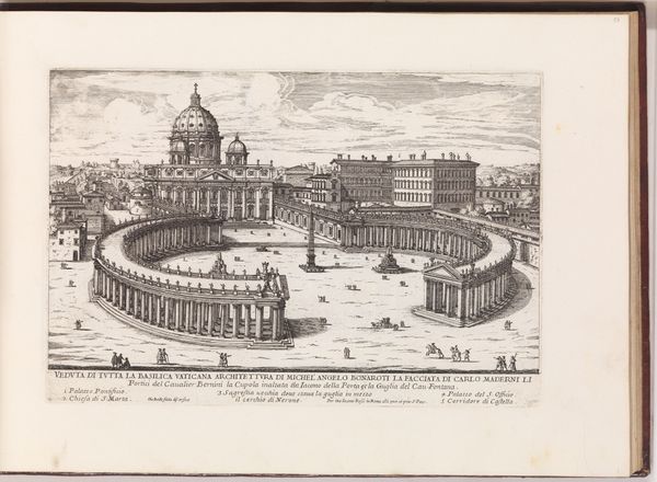
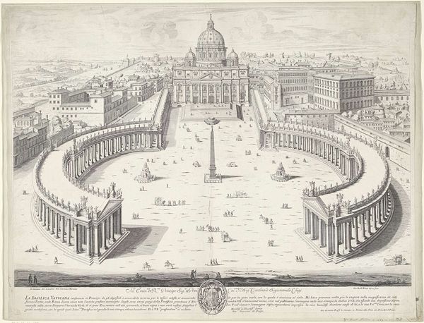
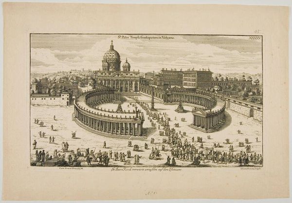
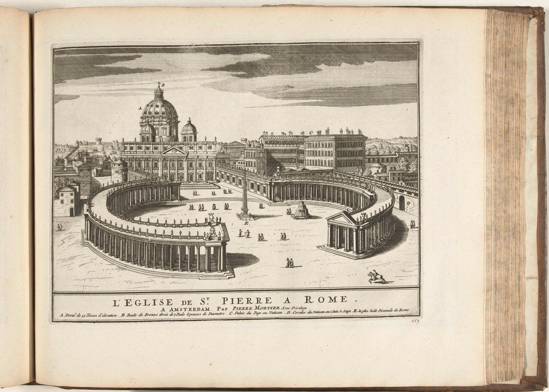
Editor: So, this is a print called "Sint-Pieter te Rome," or Saint Peter's in Rome, from 1726 by an anonymous artist. It's a cityscape, created using etching and engraving. The scene has this impressive yet almost sterile feeling, maybe because it's so architectural. What do you see in this piece that I might be missing? Curator: Ah, yes! Sterile is one word for it. I might say "orderly". What grabs me first is the sheer ambition, the reach of the baroque spirit. It's a visual flexing of power, isn’t it? You get the impression of someone standing far back with a very precise, maybe even a mathematical, eye, capturing all the grandeur, every detail rendered with painstaking clarity. But is that clarity honest? Do you get a feeling of real life there, or just...ideals? Editor: It’s interesting you say that. The clarity, almost hyper-clarity, definitely mutes the ‘real’ feeling of the place. Like a dream of Rome. But why this distance, do you think? Curator: Maybe distance offers control? Baroque art loves drama, but it also adores order, right? Here, distance lets the artist arrange the composition for maximum impact – the embracing curve of the colonnade, the commanding dome. Do you think the small figures enhance the composition? Editor: I see what you mean! They're tiny, almost like afterthoughts. Maybe it emphasizes the vastness of the space, makes it more awe-inspiring? I hadn’t considered the manipulation aspect before. Curator: Exactly! This print whispers secrets about power, perspective, and perhaps, the curated nature of perception itself. I think my perspective on cityscapes is forever changed! What about you? Editor: Absolutely. I see now how even in something seemingly straightforward, like a cityscape, there are layers of meaning and intent waiting to be uncovered. This conversation has been an epiphany!
Artwork details
- Medium
- print, etching, engraving, architecture
- Dimensions
- height 222 mm, width 296 mm
- Location
- Rijksmuseum
- Copyright
- Rijks Museum: Open Domain
Tags
Comments
Share your thoughts
About this artwork
Editor: So, this is a print called "Sint-Pieter te Rome," or Saint Peter's in Rome, from 1726 by an anonymous artist. It's a cityscape, created using etching and engraving. The scene has this impressive yet almost sterile feeling, maybe because it's so architectural. What do you see in this piece that I might be missing? Curator: Ah, yes! Sterile is one word for it. I might say "orderly". What grabs me first is the sheer ambition, the reach of the baroque spirit. It's a visual flexing of power, isn’t it? You get the impression of someone standing far back with a very precise, maybe even a mathematical, eye, capturing all the grandeur, every detail rendered with painstaking clarity. But is that clarity honest? Do you get a feeling of real life there, or just...ideals? Editor: It’s interesting you say that. The clarity, almost hyper-clarity, definitely mutes the ‘real’ feeling of the place. Like a dream of Rome. But why this distance, do you think? Curator: Maybe distance offers control? Baroque art loves drama, but it also adores order, right? Here, distance lets the artist arrange the composition for maximum impact – the embracing curve of the colonnade, the commanding dome. Do you think the small figures enhance the composition? Editor: I see what you mean! They're tiny, almost like afterthoughts. Maybe it emphasizes the vastness of the space, makes it more awe-inspiring? I hadn’t considered the manipulation aspect before. Curator: Exactly! This print whispers secrets about power, perspective, and perhaps, the curated nature of perception itself. I think my perspective on cityscapes is forever changed! What about you? Editor: Absolutely. I see now how even in something seemingly straightforward, like a cityscape, there are layers of meaning and intent waiting to be uncovered. This conversation has been an epiphany!
Comments
Share your thoughts