Dimensions: height 502 mm, width 336 mm, height 761 mm, width 553 mm
Copyright: Rijks Museum: Open Domain
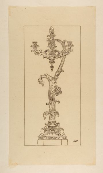
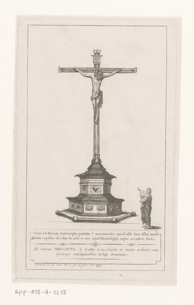
Curator: Here we have Luigi Valadier's "Design for a Crucifix," dating roughly from 1775 to 1785. It’s rendered in pencil and watercolor. Editor: Wow. My first thought? Overwhelming. It’s visually heavy, dripping in Baroque opulence but simultaneously delicate, almost ephemeral, because it is a sketch. A golden ghost of an object. Curator: The Baroque aesthetic certainly prioritized lavishness. You can see the detailed ornamental base supporting the crucifix itself. Valadier, as a skilled metalworker himself, likely paid great attention to the materiality implied within the drawing. Consider the likely costs of materials and the labor required for the project if realized. Editor: Right, and I’m thinking about the symbolism. The crucified Christ above, two figures keeping vigil… Below, in that glass-encased section in the base… is that meant to represent the body of Christ in the tomb? Curator: Yes, that’s my understanding. Observe the craftsmanship. The contrast between the weight of the crucifix above and that transparent space below speaks to Baroque theatricality. It creates an effect intended to provoke thought and awe within its audience. I would guess that even the type of gilding, chasing, and casting for each figure was considered. Editor: Absolutely. It feels so intensely human, even in its grandeur. I’m almost feeling what the patron of the original work must have wanted someone to feel while in its presence, which, if actually produced, would be enormous. Here, in watercolor and pencil, its as if the dream of its impossible hugeness is laid bare. It almost makes you feel the weight, spiritually. Curator: The materiality and making of an object designed to express deep human convictions... Editor: Beautiful. Thanks for that glimpse behind the gilding.
Comments
No comments
Be the first to comment and join the conversation on the ultimate creative platform.
More like this