Copyright: CC0 1.0
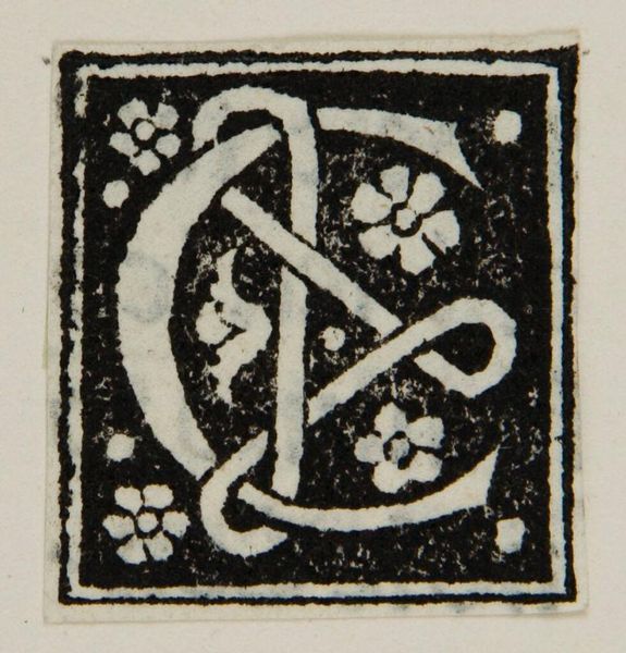
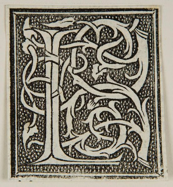
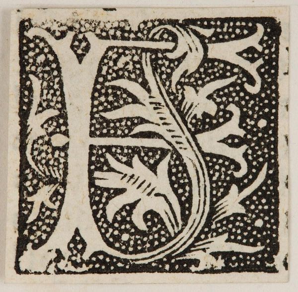
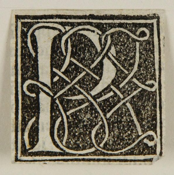
Curator: Before us is "Letter L", an intriguing initial designed by an anonymous artist. Editor: The immediate impression is one of ornate constraint – a visual push and pull between the crisp, bold letterform and those delicate, swirling tendrils. Curator: The black and white contrast certainly emphasizes its structural elements, doesn’t it? I’m drawn to the relationship between positive and negative space, the letter ‘L’ itself almost emerging from the darkness. Editor: And those floral motifs, though simple, hint at growth, rebirth. The ‘L’ becomes a foundation, a starting point for something organic. Perhaps it's related to illuminated manuscripts. Curator: It's fascinating how the artist uses these graphic elements to create a sense of depth, despite the limited color palette and apparent flatness of the printing process. Editor: It speaks to the power of symbols, doesn’t it? Even a single letter, adorned with such care, can carry layers of meaning. Curator: Indeed. This work, with its stark simplicity and intricate design, offers a world of reflection. Editor: A beautiful testament to the enduring power of visual language.
Comments
No comments
Be the first to comment and join the conversation on the ultimate creative platform.
More like this