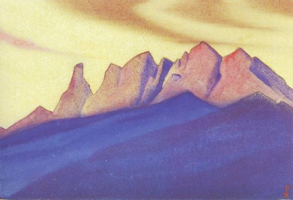
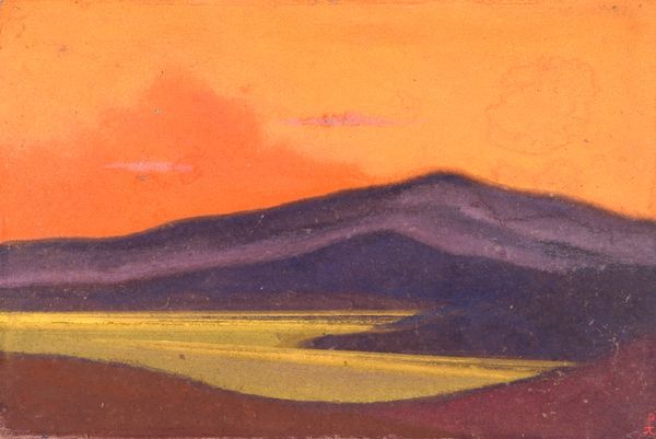
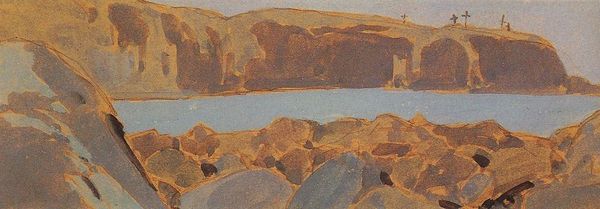
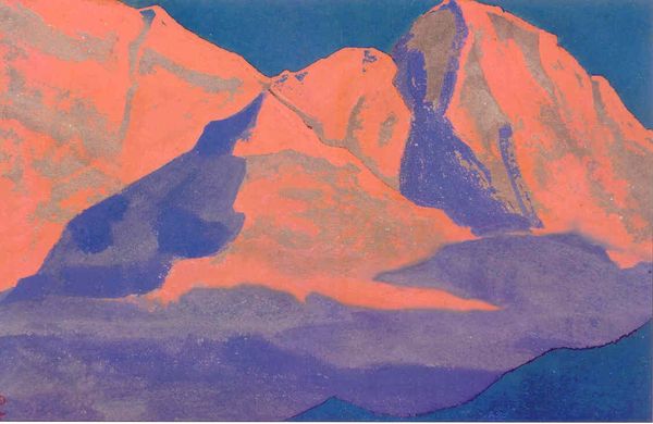
Tempe-jal-tzen-baykin (City of mobster Ja Lama) 1928
0:00
0:00
nicholasroerich
Rose Art Museum (Brandeis University), Waltham, MA, US
painting, watercolor
#
painting
#
landscape
#
watercolor
#
abstraction
#
line
Copyright: Public domain
Nicholas Roerich painted "Tempe-jal-tzen-baykin" with what looks like watercolour, and maybe some gouache. There's a real sense of process here, layers gently brushed across the surface. The colours feel like they're breathing. It's so simple, just bands of colour that suggest land, mountains, and sky. But look closer, the paint isn't flat. See how the colours shift, fade, and intensify? He coaxes the paint to do so much with so little. Notice the mountains, how they’re outlined in this dark blue, as though the whole scene is being pressed gently between the pages of a book? Roerich reminds me of Hilma af Klint in his search for a symbolic language. Both use colour to express some kind of spiritual essence. Ultimately, Roerich’s work, like all good art, celebrates the journey, the discovery, and the many ways of seeing. There are no mistakes, just paths we choose to follow.
Comments
No comments
Be the first to comment and join the conversation on the ultimate creative platform.
More like this