Copyright: Public Domain
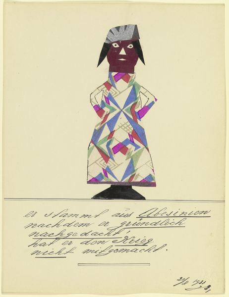
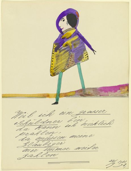
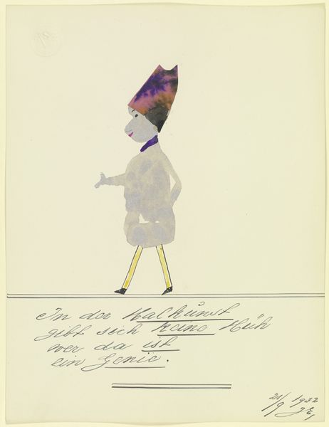
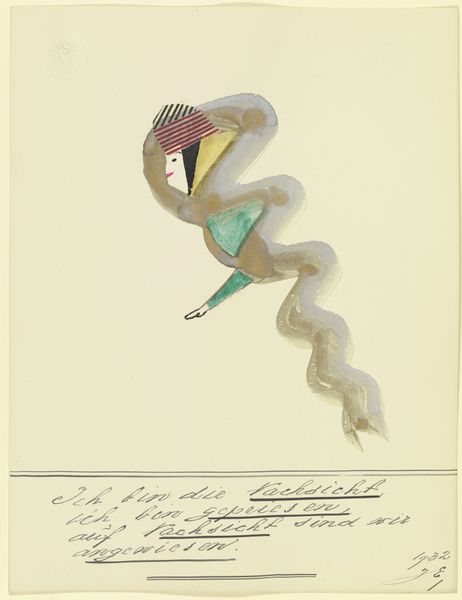
Editor: We're looking at John Elsas’ 17107 (\u201eHier ist zu sehen die Zeit der Not \u2026\u201c) from 1932, a drawing incorporating collage and gouache. There's a striking, almost childlike, figure constructed from layered shapes. What jumps out at me is how the artist uses very basic geometric forms to represent something complex. What do you see in this piece? Curator: The formal elements immediately draw my attention. Note the stark contrast between the saturated purple and the muted background. The composition relies on a central, almost symmetrical, figure, but that symmetry is deliberately disrupted. Observe how the color choices create dissonance, avoiding harmonious blending. Why do you think the artist chose this specific, limited color palette? Editor: I guess to amplify that sense of unease? The title, referencing "the time of need," combined with the discordant colors, maybe creates a feeling of anxiety? I see this imbalance repeated in the texture of the piece. Curator: Precisely. Look at the varying textures, from the flat planes of color to the almost frantic application of white gouache. There's a push and pull between order and chaos, flatness and depth. Does this contrast reveal anything about its emotional weight? Editor: Absolutely! The artist creates an awkward depth, yet seems to reject any perspective. It feels unfinished and somehow raw and emotional. Curator: The materials themselves contribute to this sense of immediacy, a feeling of the work being quickly assembled, a snapshot of a raw nerve. By reducing form to this almost primitive level, the artist underscores the desperation embedded within the image. Editor: It is fascinating how limiting your choices accentuates emotional intensity. I’ll definitely remember how Elsas created it using just compositional shapes and colors.
Comments
No comments
Be the first to comment and join the conversation on the ultimate creative platform.
More like this