Copyright: Clarence Holbrook Carter,Fair Use
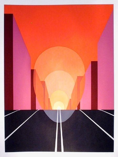
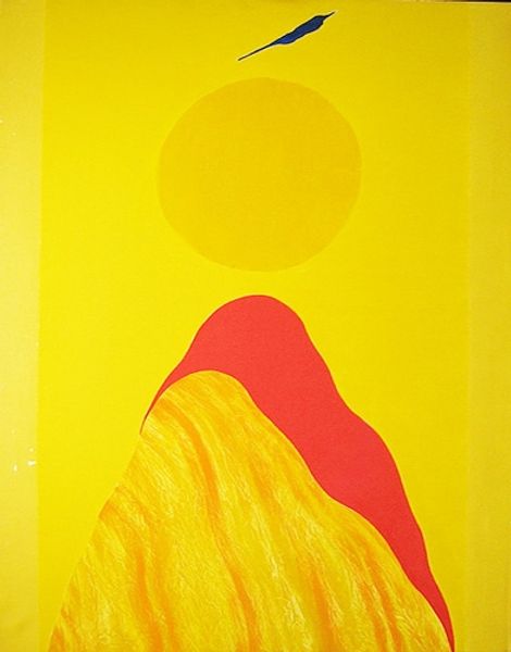
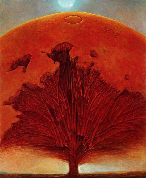
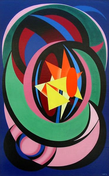
Editor: This is Clarence Holbrook Carter’s "Burning Bush," a print from 1978. The colors really pop—oranges and purples create a striking contrast. It feels very graphic and modern, almost like a stylized logo. What do you see in this piece, beyond the immediate visual impact? Curator: Indeed. If we attend purely to the internal dynamics, consider the geometric structuring. The interplay of circles, softened edges, and flame-like projections is compelling. We might even apply some structuralist frameworks. The composition’s symmetry and asymmetry yield insights. Editor: Symmetry and asymmetry? How so? It looks fairly symmetrical to me. Curator: Note how the flame emanates from the center. The overall structure appears bilaterally symmetrical. But closer examination reveals subtle variations. For instance, the thickness of the flame’s projections. Also, consider how color modulates our interpretation of form. Semiotics allow us to examine further meaning behind formal presentation. Editor: Interesting! I hadn't thought of that, I was too caught up in the obvious contrasts of color, almost "Pop Art". Now, I observe how the forms interrelate, as though creating internal dialogues with each other, how does this guide further interpretations? Curator: Precisely. Consider also the tension created by color. It yields depth, but also introduces spatial ambiguities. Carter’s choices actively subvert clear readings, resisting easy consumption. Editor: I can definitely see the visual strategies at play here. I appreciate the discussion! Curator: A rewarding look for us both! Thank you!
Comments
No comments
Be the first to comment and join the conversation on the ultimate creative platform.
More like this