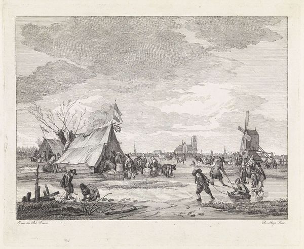
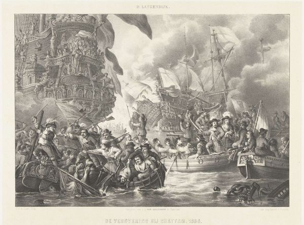
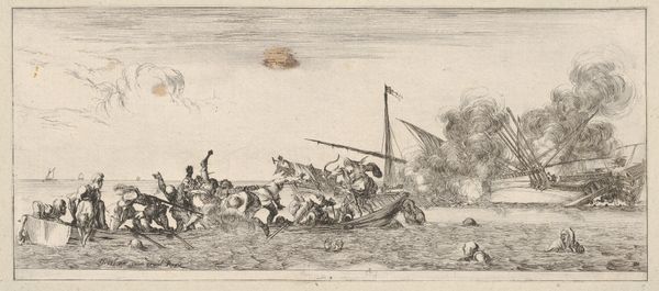
print, engraving
# print
#
romanticism
#
cityscape
#
history-painting
#
engraving
Dimensions: height 361 mm, width 478 mm
Copyright: Rijks Museum: Open Domain
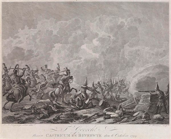
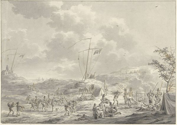
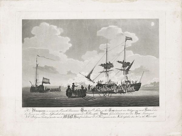
Editor: This is Cornelis Brouwer's print titled "Landing van de Britten bij Callantsoog, 1799," created between 1799 and 1801. It depicts the British landing at Callantsoog, rendered in engraving. I'm struck by the chaotic energy of the composition. It really captures the intensity of the battle. What do you see in this piece? Curator: What commands attention, structurally, is how Brouwer orchestrates tonal contrasts to direct our gaze. The artist masterfully juxtaposes light and shadow, manipulating depth of field through the strategic gradation of tone and distinct placement of textual elements within the landscape. Observe how the varying line weights enhance depth, contrasting textures, and volume in an engraving using primarily neutral hues, focusing primarily on the structure of the composition. Note how the horizon's sharpness recedes from foreground toward background which influences our emotional engagement. Editor: So, you’re focusing more on the visual mechanics, like how the shading gives the illusion of depth. I see what you mean about how line weight gives dimension, I never really noticed how it creates volume. What about the people? Curator: Indeed. Notice their placement in relation to each other creates narrative interest. How their poses and grouping adds a narrative, while, as we established earlier, line weight creates mass in figures. It's through these formal relationships that Brouwer compels the viewer to experience tension. Editor: That’s fascinating! I was so caught up in trying to understand the story. Seeing the emphasis put on purely formal qualities really reframes how I see art! Curator: Indeed. This close scrutiny cultivates an enhanced understanding.
Comments
No comments
Be the first to comment and join the conversation on the ultimate creative platform.
More like this