#
portrait
#
pencil sketch
#
charcoal drawing
#
possibly oil pastel
#
portrait reference
#
pencil drawing
#
underpainting
#
men
#
animal drawing portrait
#
portrait drawing
#
watercolour illustration
#
watercolor
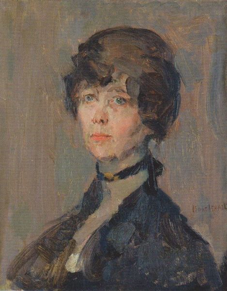
Dimensions: 10 7/8 x 8 1/8 in. (27.6 x 20.6 cm)
Copyright: Public Domain
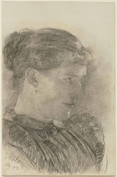
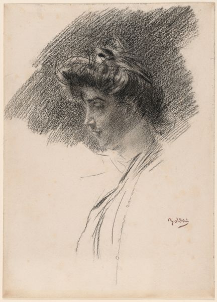
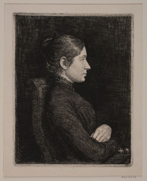
Curator: This intriguing work before us is "The Veronese Print" by J. Carroll Beckwith, dating from around 1887 to 1890. It's currently housed right here at the Metropolitan Museum of Art. Editor: My first impression is one of subdued elegance, almost melancholic. The muted tones of what appears to be charcoal or pencil lend it a certain intimacy, as though we’re intruding on a private moment. The sitter's gaze directed off to the side definitely contributes to that feeling. Curator: Precisely. The work showcases Beckwith's adeptness at capturing likeness and form. He was known for his portraits, and often sketched figures in preparation for larger works. Looking closely, the title alludes to the faint image in the background: a depiction after Veronese. It is a layered approach: a portrait within a portrait. Editor: This doubling certainly speaks to how images accrue meaning over time. The inclusion of the Veronese print creates a dialogue across centuries, linking this woman's image with the broader artistic canon – perhaps even asking questions about access, privilege, and who gets represented in art. Is the “Veronese print" indicative of the sitter's aspirational identity? Does she wish to imbue the same symbolic representation of, say, "Judith with the Head of Holofernes" into her own image? Curator: An interesting thought. Contextually, during the late 19th century, women were increasingly entering artistic spheres as both subjects and creators, so the allusion might subtly nod to her connection to those cultural developments and what was accepted for viewing during this time, while hinting to an individual story. How would you say the medium impacts the tone here? Editor: The sketch-like quality evokes a sense of immediacy and process, which feels surprisingly modern for a portrait from that era. Also, the fact it might be charcoal/pastel as an illustration makes me feel the image speaks more about representation than it does about simply displaying class or power. It is not showy, the figure is posed but rather casual; and this directs our reading in terms of class representation. It evokes this intimate snapshot feeling that many photographers were going for as well in this era, while painters were focused on big brush strokes and light effects in en-plain air scenes. Curator: Indeed. Beckwith's choice to render this portrait as a preparatory study gives it a particular vulnerability and honesty, which I believe invites us to engage with the subject beyond merely acknowledging her societal status or external image. Editor: I agree. And by questioning the role of the subject, and placing a Veronese allusion into the image's frame, it expands the possibility for us, the modern viewers, to also insert ourselves within these questions. I’m leaving this viewing thinking more deeply about how we interpret representation within the politics of seeing. Curator: An excellent way to summarize. I am grateful this artwork reminded us of the artist’s vision within cultural developments that defined his subject’s place in art.
Comments
No comments
Be the first to comment and join the conversation on the ultimate creative platform.
More like this