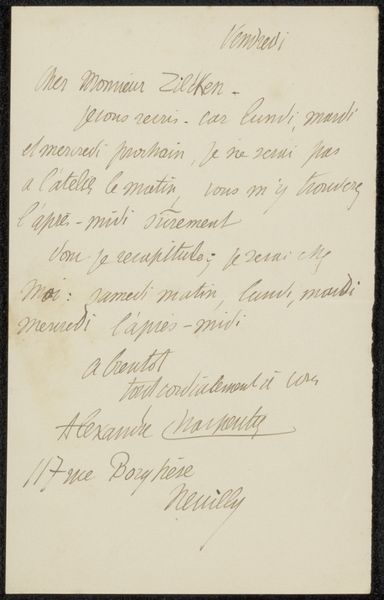
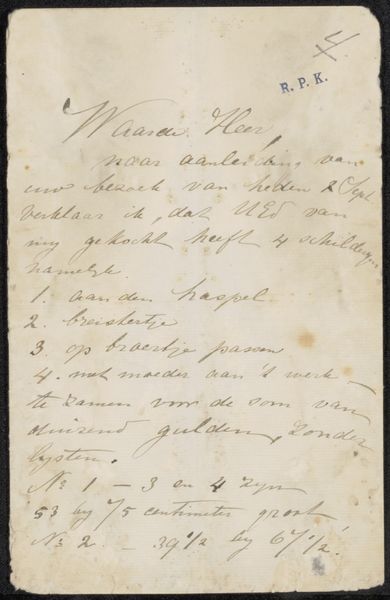
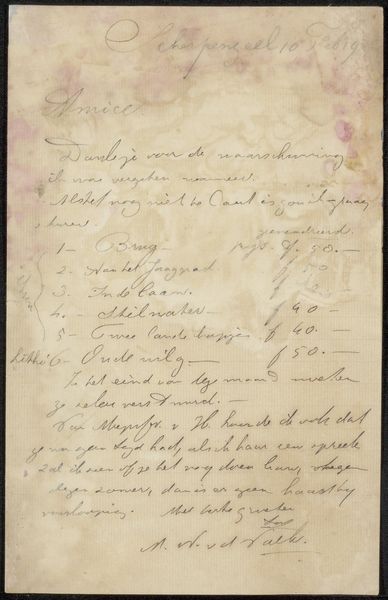
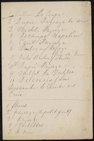
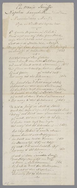
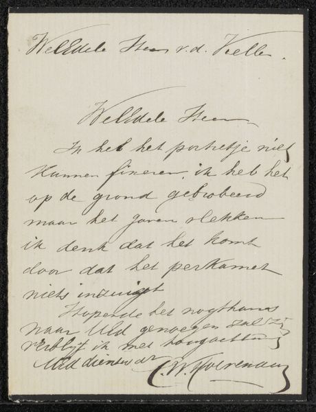
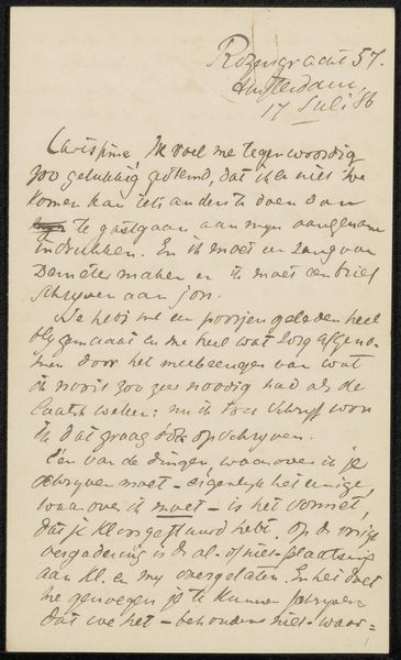
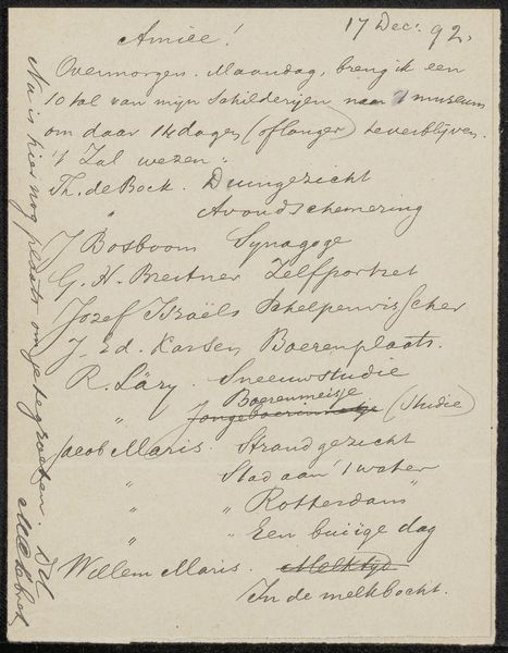
drawing, paper, ink
#
drawing
#
paper
#
ink
#
calligraphy
Copyright: Rijks Museum: Open Domain
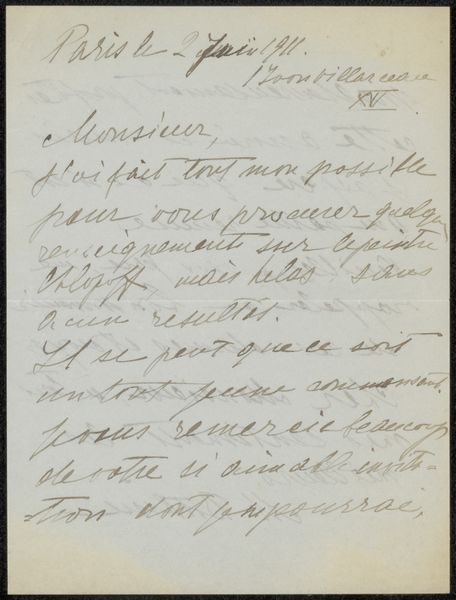
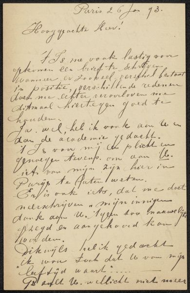
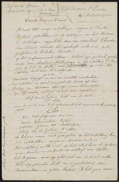
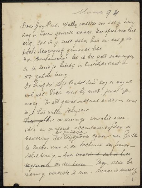
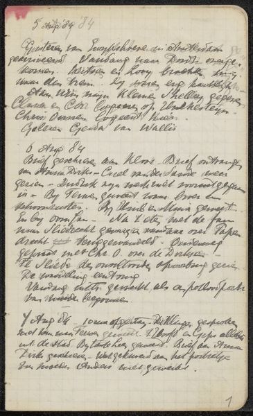
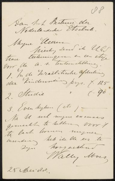
Curator: This is "Brief aan Jan Veth," a drawing in ink on paper, potentially from 1895, by Henri Gilius Samson. It presents itself as a handwritten letter. Editor: It looks like an informal note or a to-do list, really, penned in cursive script on aged paper. The overall texture is visually dense because the handwriting crowds the available space. It definitely has a sense of intimacy because of the informality of the media used and also it’s size. What do you see in this piece, looking at it as an art historian? Curator: I observe first the interplay of form and ground, the stark contrast of dark ink against the off-white paper creating a striking visual rhythm. The script, with its varying weight and pressure, articulates a dynamic tension across the surface. Consider the way the artist manipulates line—thickening it for emphasis, thinning it to connect words into fluid phrases. Do you discern any deliberate patterning or structure within this seemingly casual arrangement? Editor: Well, I can't read Dutch so the content escapes me. But the lines certainly give it a texture and form. Almost like a musical score? Or I guess what you’re suggesting is that the form and not the meaning matters in this piece. Curator: Precisely! Devoid of immediate legibility to the non-Dutch speaker, our eyes are drawn to the abstract qualities of the composition. How the ascenders and descenders create verticality, the loops and curves forming miniature abstract designs, like musical notation—an apt analogy. The density and sparsity of ink orchestrate a visual music independent of semantic meaning. Editor: That's an interesting way of looking at it. I never considered approaching script like a visual composition, appreciating it beyond its readability. Curator: By isolating the formal elements—line, texture, contrast—we unlock another layer of aesthetic appreciation. It compels us to consider the sheer materiality of the piece and to see the art not as just something legible or didactic, but something primarily visual and textural. Editor: So I guess this note it then like an abstract landscape created only out of writing! I suppose you have a point because in general our eyes and brain attempt to discover form and structure even if a text might be incomprehensible! Thank you for sharing!
Comments
No comments
Be the first to comment and join the conversation on the ultimate creative platform.
More like this