print, engraving
# print
#
old engraving style
#
mannerism
#
figuration
#
ancient-mediterranean
#
history-painting
#
engraving
Dimensions: height 87 mm, width 103 mm
Copyright: Rijks Museum: Open Domain
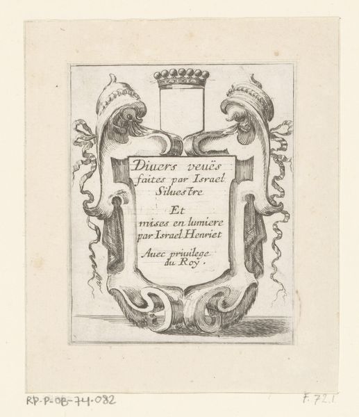
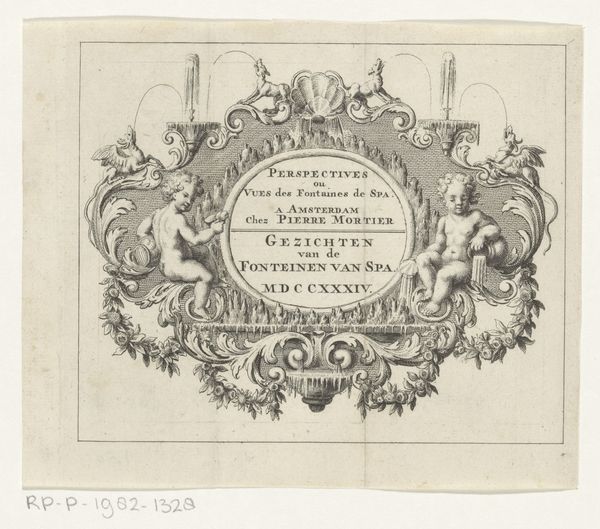
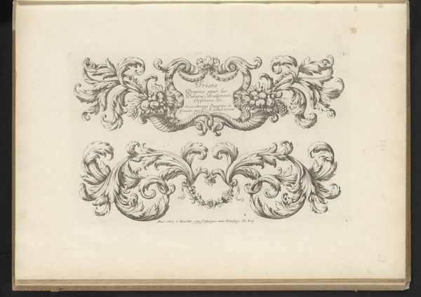
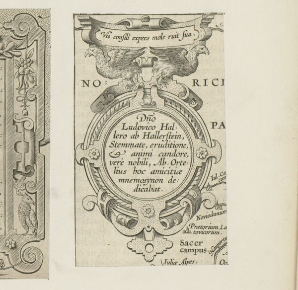
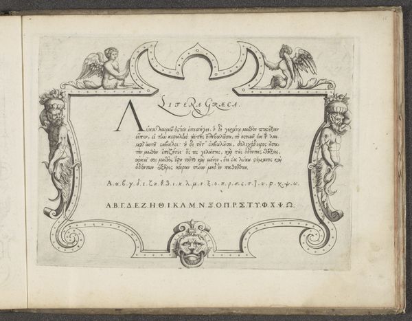
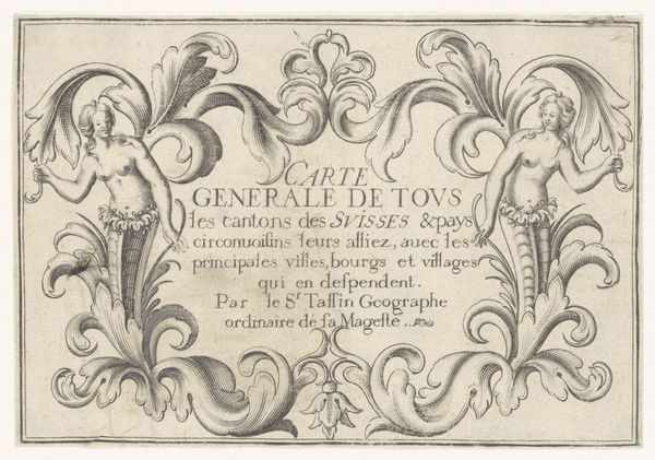
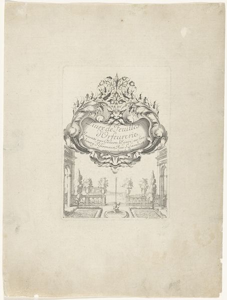
Curator: Looking at this engraving, what catches your eye immediately? Editor: There’s something about the stark contrast and the way the figures seem to float around that central text… It feels almost dreamlike, a bit surreal. What exactly are we looking at? Curator: This is a “Ronde cartouche met twee manfiguren,” dating from 1572 to 1575. The inscription in the center could allude to propaganda, but we can only speculate. This particular piece, attributed to an anonymous artist, uses engraving to depict classical figures framing a central inscription. Editor: So, the figures… they're not just decorative. Do we know anything about who these characters might be, and why this style? It reminds me a little bit of…theater set design meets a really elaborate doodle. Curator: Precisely! The style definitely leans into Mannerism, popular at the time, drawing on themes of figuration, which gives us space to talk about representations of the human form in this period. Considering the ancient stylistic components present alongside a burgeoning early modern aesthetic, the engraving could reflect broader socio-political conversations about civic responsibility at that time. Editor: I guess, thinking about it, maybe that's why it gives me this staged feeling. But despite the weight of all that history, and potential context it feels delicate. Those super-fine lines must have taken hours! And it really throws the two characters surrounding it to the forefront. Is this an advertisement, perhaps? It is also in such amazing shape for its age. Curator: Some scholars do think this print style was used for disseminating political information or pronouncements, so this might be an early form of that! I like how you picked up on the details that are present with the engraving as well. Its amazing how artists made pieces during this time. Editor: Looking closer, the combination of figures with the bold font of the letters, really it all just speaks of an era obsessed with layering meaning into everything! A lovely little thought capsule if I do say so myself! Curator: Definitely, an insightful encapsulation of an era grappling with history and representation, with some beautiful visual language thrown in!
Comments
No comments
Be the first to comment and join the conversation on the ultimate creative platform.
