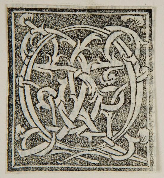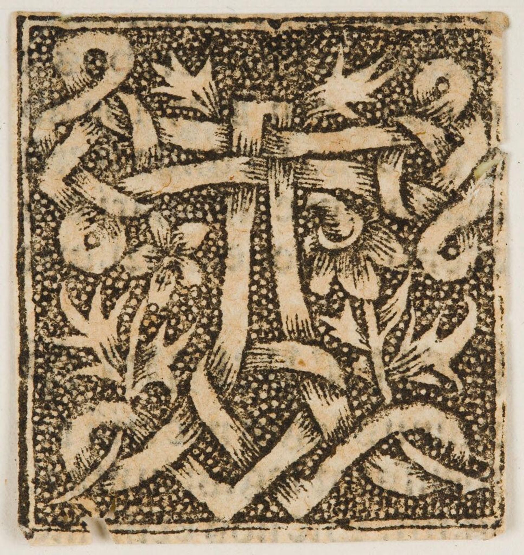
c. 16th century
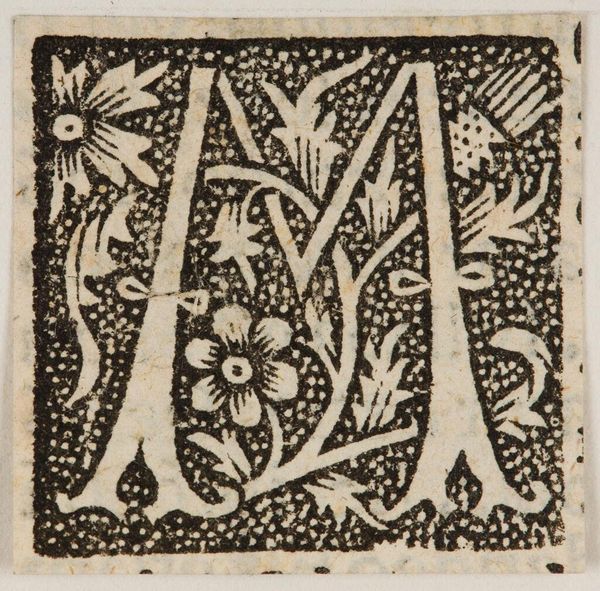
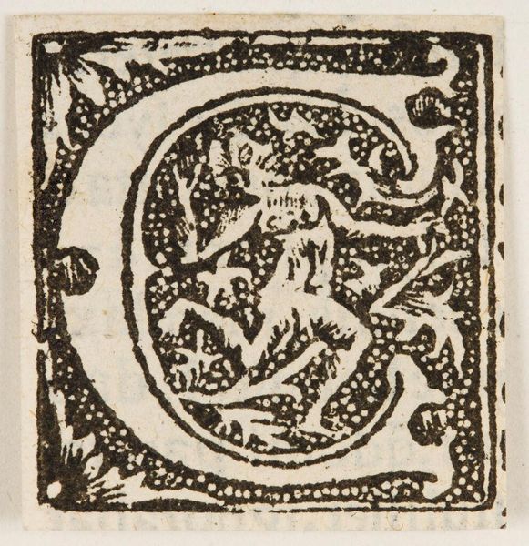
Initial A
Listen to curator's interpretation
Curatorial notes
Editor: This is a print called Initial A, made by an anonymous artist. The stark contrast immediately grabs you. What formal qualities stand out to you? Curator: The dense, textural background immediately strikes me. The artist’s choice to surround the initial with a field of closely packed dots creates a compelling tension with the smooth lines of the interwoven letter. Editor: So, the contrast emphasizes the initial's form? Curator: Precisely. The interplay between positive and negative space, the curvilinear forms against the rectilinear structure of the "A" itself - it all contributes to a dynamic visual experience. What do you make of the floral motifs? Editor: I hadn't considered those elements in relation to the letterform itself, but I see how they contribute to the overall texture. Curator: Indeed, the contrast is palpable.