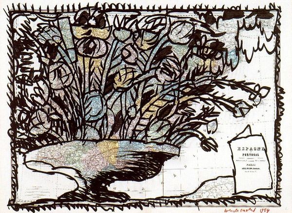
drawing, graphic-art, print, linocut, ink
#
drawing
#
graphic-art
#
abstract expressionism
#
ink painting
# print
#
linocut
#
ink
#
linocut print
#
abstraction
#
line
Copyright: Pierre Alechinsky,Fair Use
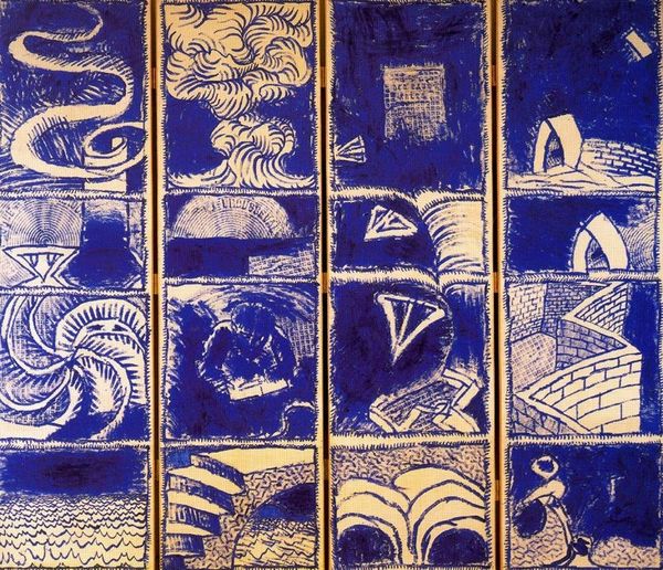
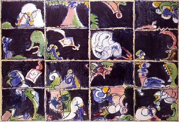
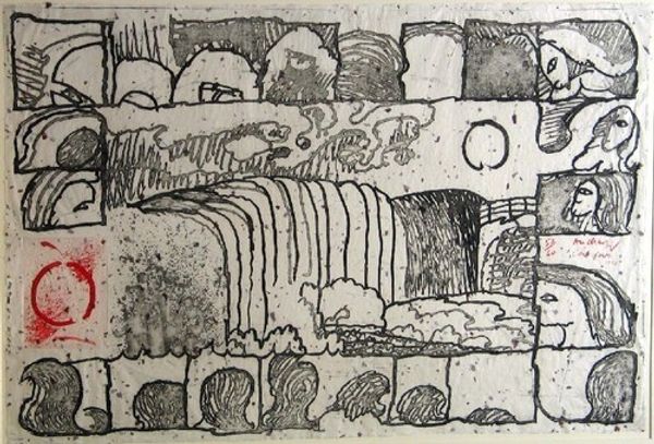
Curator: Before us, we have "Vocabulaire I" by Pierre Alechinsky. It's an abstract composition of graphic-art, employing a linocut print and ink to deliver its message. My immediate impression is one of fractured narratives. It is bold, blue and segmented—it seems almost like a comic without a clear story, each frame hinting at a separate world. Editor: Absolutely. And knowing Alechinsky's work, particularly his ties to the CoBrA movement, this fragmented narrative reflects the post-war anxieties and the re-evaluation of societal structures that so many artists of the period were grappling with. The choice of such a stark, almost industrial, material like linocut also speaks to this period, right? Curator: Yes, the linocut technique is very pertinent here. Think of the labor involved—the cutting, the inking, the pressing. It’s a far cry from the more traditional, delicate forms of printmaking and aligns well with the era's shifting values and artistic material practices. Editor: Considering the process further, linocut, historically, was often used for posters and mass-produced imagery. Is Alechinsky intentionally blurring those boundaries, elevating the utilitarian craft into "high art?" Also, notice how he organizes the panels – it’s reminiscent of modular designs, almost architectural blueprints that reflects the rebuilding efforts taking place during his career. Curator: Exactly! It subverts those established hierarchies. But, for me, there's also a deeper reading tied to the visual vocabulary at play here. These recurring symbols, these abstract figures… they form a lexicon of the subconscious, alluding to universal archetypes in dialogue with more contemporary symbols of alienation and fragmentation. It reflects a world trying to define itself amidst upheaval. Editor: A lexicon is a very fitting way to frame it. I also consider how the materials might further represent those sentiments – the bold, blue ink almost a deliberate signifier reminding me of industrial printing but also referencing earlier blue prints used within development. I agree; the symbolism offers many points of analysis about industrial advancements and artistic methods. Curator: Yes, indeed. His mark-making invites reflection about our historical relationship to material production in relation to art. The stark contrast further serves to explore questions of representation that impact meaning construction and societal communication in various forms. Editor: Looking closely reveals more about Alechinsky’s artistic mission in “Vocabulaire I”, challenging assumptions about what art is, how it's made, and whom it’s for while asking relevant questions about societal roles of different kinds of artistry and production during his era. Curator: Ultimately, it is an image rooted in our socio-historical context and also one that, provocatively, resists fixity. The arrangement can almost feel deliberately ambiguous – encouraging engagement across difference within the artwork.
Comments
No comments
Be the first to comment and join the conversation on the ultimate creative platform.
More like this