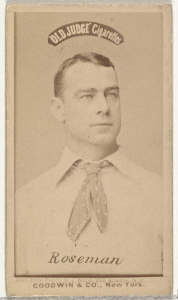
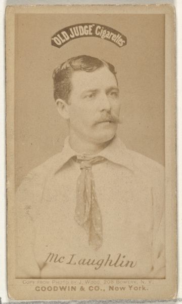
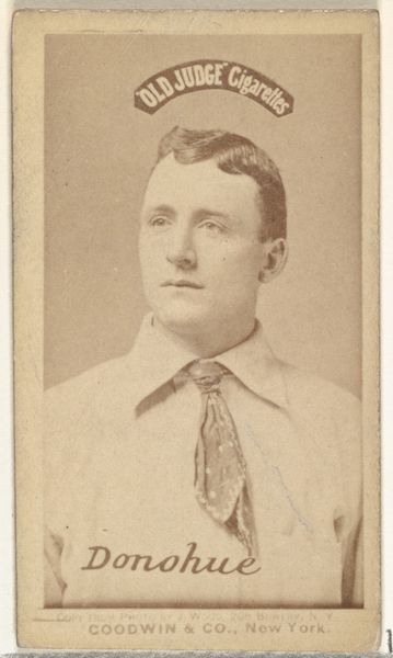
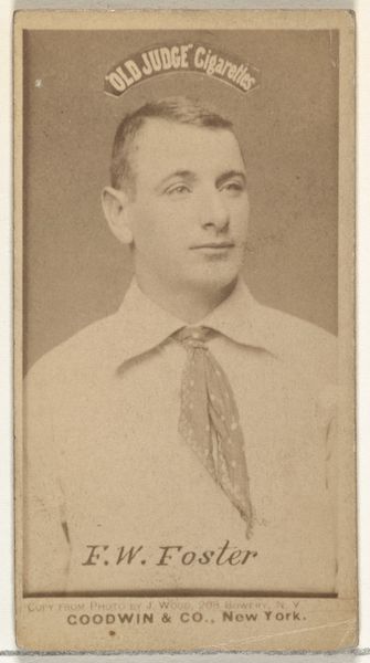
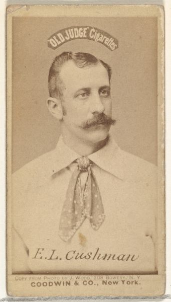
Albert C. "Al" Mays, Pitcher, Brooklyn Bridegrooms, from the Old Judge series (N172) for Old Judge Cigarettes 1887 - 1890
0:00
0:00
drawing, print, photography
#
portrait
#
drawing
# print
#
caricature
#
baseball
#
photography
#
historical photography
#
19th century
#
men
#
portrait drawing
#
athlete
Dimensions: sheet: 2 11/16 x 1 3/8 in. (6.9 x 3.5 cm)
Copyright: Public Domain
Editor: Here we have Albert C. "Al" Mays, Pitcher, Brooklyn Bridegrooms, from the Old Judge series, created by Goodwin & Company between 1887 and 1890. It's a portrait, primarily drawing and print, intended as a baseball card and cigarette advertisement. I’m immediately drawn to its monochromatic, almost sepia, tone and how the texture seems both photographic and somehow hand-drawn. It makes it seem both modern and very old at once. What jumps out to you, and how might we formally interpret this intriguing piece? Curator: Formally speaking, one immediately notices the sharp contrast between the smooth, almost porcelain-like skin of Mays and the textured background, achieved through photographic and printing techniques. Note the distinct segmentation; the oval framing the player’s face versus the geometric text announcing “Old Judge Cigarettes.” This dichotomy creates visual interest. How might you read the textual elements, beyond their obvious advertising function? Editor: Well, the "Old Judge Cigarettes" banner seems to float almost unnaturally above his head, lending an oddly devotional quality to the commercial image. Is the text supposed to almost “halo” Mays? Curator: An astute observation. Considering the semiotic value, observe how the text's placement impacts our interpretation of Mays. His gaze directs the eye upwards toward the brand; his almost serene expression juxtaposed with the commercial advertisement generates a system of meanings wherein Mays functions as both athlete and aspirational symbol. Editor: That tension between the art and the advertising is something I hadn't considered at first. Now that you point it out, the layering and almost awkward placement of the text makes the piece seem more self-aware. It uses the sport and its figures to sell something entirely separate. Curator: Precisely. These structural contrasts are key to appreciating the piece beyond its superficial depiction. Considering this early form of sports advertisement, where might you locate visual evidence for that synthesis? Editor: Thinking about structure again, the artist made him into both celebrity and salesman through layering techniques, from the background right down to the signature with his name across the jersey! Curator: Excellent. Indeed, these tensions in the work are central to the reading. Thanks to a careful viewing, we might reconsider what function photography serves, at all.
Comments
No comments
Be the first to comment and join the conversation on the ultimate creative platform.
More like this