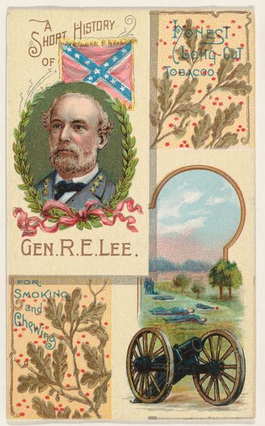
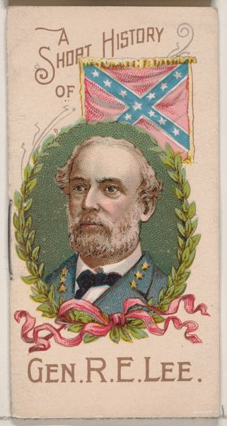
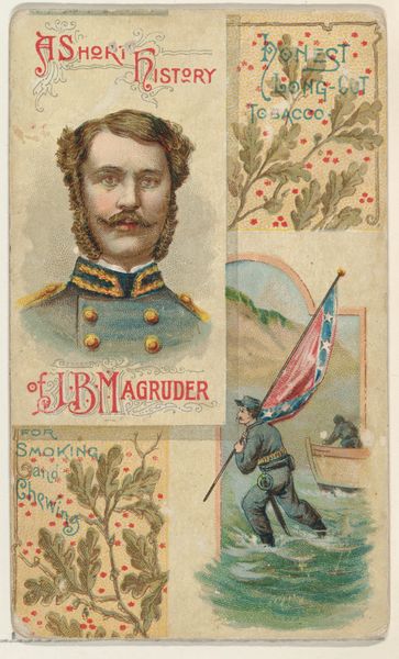
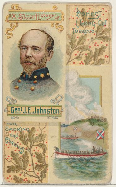
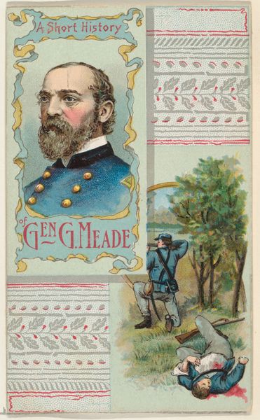
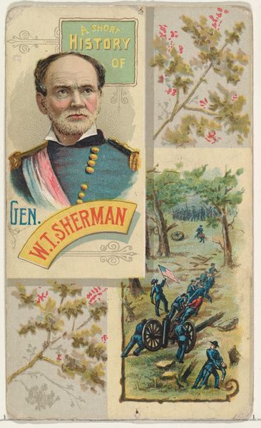
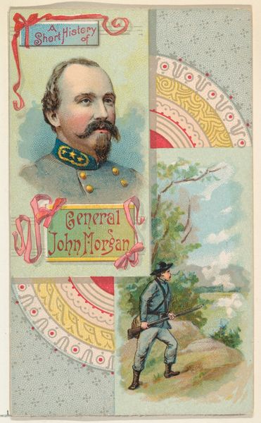
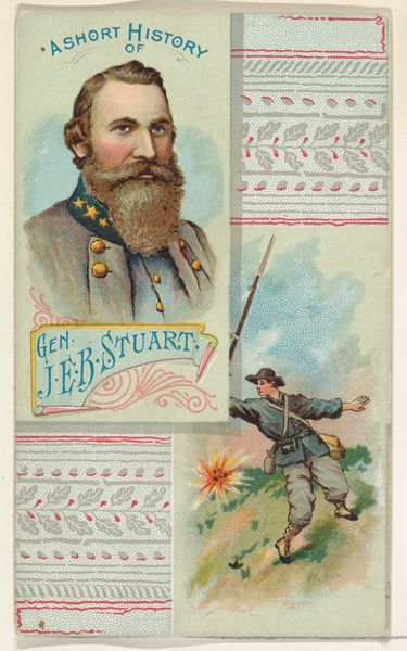
A Short History: General Robert E. Lee, from the Histories of Generals series (N114) issued by W. Duke, Sons & Co. to promote Honest Long Cut Smoking and Chewing Tobacco 1888
0:00
0:00
Dimensions: Sheet: 4 3/16 × 2 1/2 in. (10.7 × 6.4 cm)
Copyright: Public Domain
Editor: This lithograph, titled "A Short History: General Robert E. Lee," was created around 1888 by W. Duke, Sons & Co. as a promotional item for their tobacco products. The image presents a portrait of General Lee encircled by a laurel wreath, but it's the fragmented composition and juxtaposition of portrait, cannon, landscape and Confederate flag that catches my eye. What do you make of the organization of elements? Curator: I find the compositional arrangement particularly intriguing. The compartmentalization into distinct visual fields—portrait, battlefield vignette, decorative friezes—disrupts any coherent narrative. Each section operates with a separate logic. Observe the portrait, formally framed and seemingly timeless, versus the implied dynamism of the cannon and battlefield. It becomes less about historical representation and more about a calculated deployment of symbols. Editor: I see what you mean. It's like the image is dissecting Lee's legacy rather than presenting a unified view. Does the juxtaposition create any sort of tension, visually? Curator: Precisely. There's a pronounced tension created by these disparate visual elements. The decorative friezes, for instance, function almost as a distancing mechanism, drawing attention to the artificiality of the construction. How does the work's symmetrical layout inform the content? Editor: I never thought of that. The equal weight to the separate visual spaces feels deliberately constructed, avoiding obvious propaganda, and promoting tobacco. Is there any deeper meaning you see beyond that? Curator: Considering its origin as a tobacco advertisement, the aesthetic choices, particularly this calculated fragmentation and the visual weights you’ve noted, seem aimed less at straightforward endorsement and more at the construction of a particular brand image rooted in an appealing historical idea. Editor: This close analysis has given me a new way to see this piece - I was definitely stuck on its superficial elements! Thank you. Curator: It has been a pleasure to use these considerations to explore the piece. It shows us how aesthetic choices reveal a purpose, beyond just what appears in the image.
Comments
No comments
Be the first to comment and join the conversation on the ultimate creative platform.
More like this