print, plein-air, photography
#
script typeface
#
script typography
# print
#
plein-air
#
editorial typography
#
hand drawn type
#
landscape
#
photography
#
hand-drawn typeface
#
stylized text
#
thick font
#
handwritten font
#
historical font
#
small font
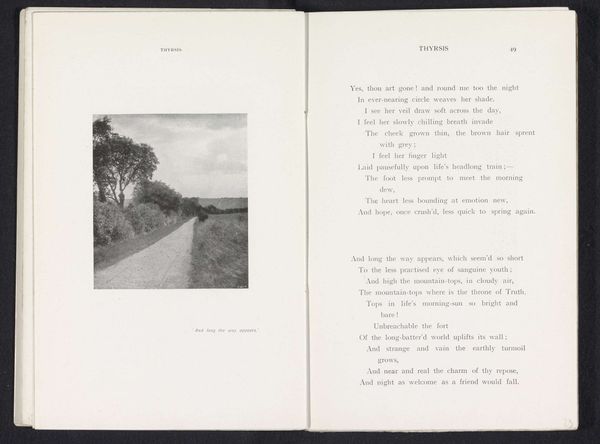
Dimensions: height 89 mm, width 137 mm
Copyright: Rijks Museum: Open Domain
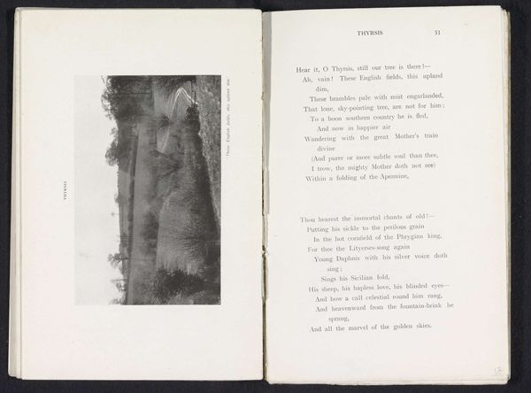
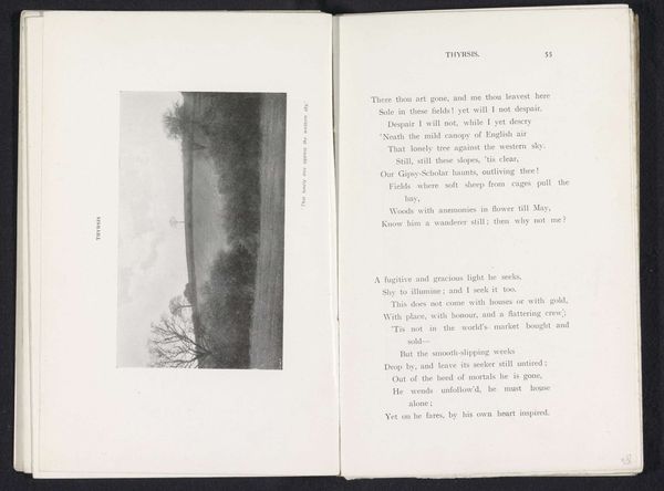
Editor: Here we have Henry W. Taunt’s photograph, “Gezicht op een helling,” which translates to “View on a Slope,” dating from before 1912. It appears to be a print in a book. The strong diagonal line dividing the light and shadow creates such a stark composition. What stands out to you in terms of form and structure? Curator: The most compelling aspect, formally, is precisely that division you noticed. The strong diagonal generates a palpable tension, and it's intensified by the sharp contrast in tonality. Light, airy areas juxtaposed against dense, almost impenetrable darkness. How do you interpret the effect of this stark contrast? Editor: It makes it feel a bit unbalanced, like the dark side is about to swallow the light. The eye is really drawn to that stark line. Curator: Precisely. And observe the texture. The modulation of light across the grass is fairly smooth, a gentle gradation, but compare this with the dense, tangled area on the opposite bank. Do you think the photographer consciously aimed at capturing such varied textures, thus contrasting light and darkness? Editor: That's a great question. Perhaps. The text accompanying the photograph talks of loss and passing time; I think this image might have been selected to emphasize such themes through contrast. Curator: Intriguing. Notice too how the horizon is placed almost precisely at the vertical midpoint. It's not a pleasing asymmetrical arrangement – there's a visual disquiet stemming from the balanced masses, do you perceive this feeling? Editor: Yes, the balanced midpoint almost cancels any feeling of traditional perspective; however, this cancellation gives the image such depth through stark contrast, more emotionally rather than optically. I see now how a formal reading can uncover layers I wouldn’t have noticed initially. Curator: Absolutely. By meticulously analyzing elements, line, shape, value, space, we can build up a more profound visual analysis that yields insights beyond subjective impressions.
Comments
No comments
Be the first to comment and join the conversation on the ultimate creative platform.
More like this