drawing, print, etching, ink, engraving
#
drawing
#
dutch-golden-age
# print
#
pen sketch
#
etching
#
old engraving style
#
landscape
#
figuration
#
ink
#
engraving
Dimensions: height 71 mm, width 105 mm
Copyright: Rijks Museum: Open Domain
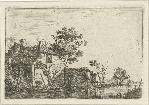
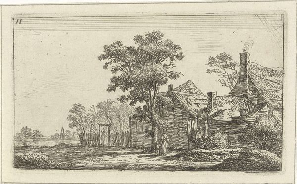
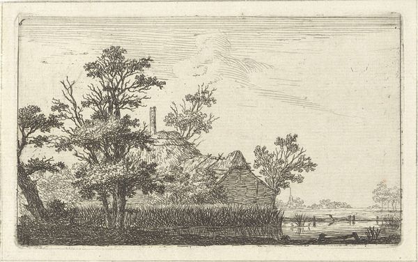
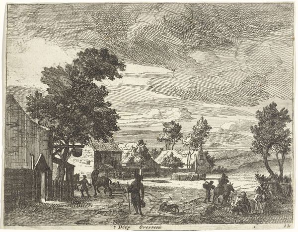
Editor: Here we have Simon Klapmuts's "Landscape with an Inn and a River," created in 1774, likely using etching, engraving, and ink. I'm struck by the intricacy achieved with simple lines, creating depth. What do you see in this piece from a formal perspective? Curator: The composition orchestrates a clear progression from the foreground's textured earth to the distant, airy expanse. Observe how Klapmuts employs line density; thicker, more concentrated lines define the foreground, rendering a tangible sense of mass and proximity, while the delicate, sparse strokes in the background evoke atmosphere and distance. Notice, too, the central tree acting as a pivotal element. How does its placement impact the visual balance of the scene? Editor: It seems to divide the scene, almost perfectly, offering equal weight on both sides but emphasizing the inn with its figures a bit more. Curator: Precisely. The structural placement redirects the gaze, choreographing a visual narrative. The river functions as a receding plane, drawing the viewer's eye towards a vanishing point. Note also the interplay between light and shadow, not dramatic contrasts, but subtle modulations achieved solely through line work. This tonal variation adds dimension, fostering a sense of three-dimensionality. Have you noticed any use of geometric or organic patterns in the composition? Editor: Now that you point it out, I see it. The building has distinct angular shapes. And in contrast, we have rounded figures like the tree and clouds, and also in the shape of the distant shoreline. Curator: Indeed. These intentional pairings, while understated, contribute to the piece's overall harmony and structural coherence. Editor: I’m starting to notice the care Klapmuts took in balancing all elements. I came for a nice scenery, but this shows a lot of thought on design and how the artwork invites the eye to move. Curator: Precisely, by analysing the structural decisions made, one can gain insights into the artist's methodology and overall understanding of how visual perception operates.
Comments
No comments
Be the first to comment and join the conversation on the ultimate creative platform.
