About this artwork
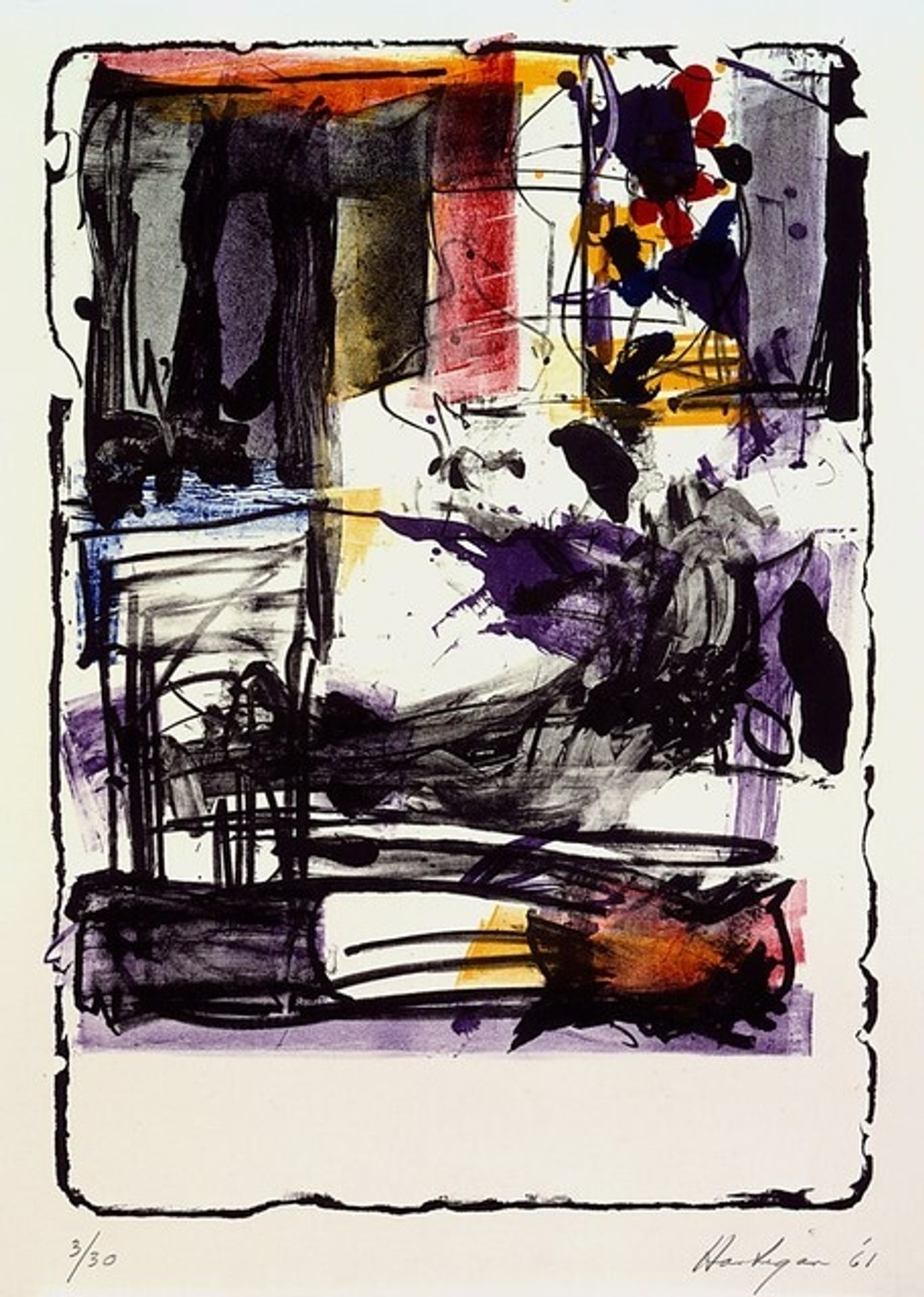
Grace Hartigan made this print, called Pallas Athene, in 1961, and right away, I'm drawn to how she lets the marks and colours collide. It feels like she’s composing with her materials as much as she is depicting anything. There’s a real physicality to this piece. You can almost feel the way the ink was dragged across the surface, pooling in some areas, barely kissing the paper in others. See that cluster of dark marks towards the upper right? They're like dark berries, or maybe a constellation. The way they sit against the lighter background creates a sense of depth, like they’re floating in space. Then, lower down, those horizontal lines give a grounded feeling, something more solid and anchored. Hartigan’s work, at least to me, is about embracing the mess and the possibility of painting. She reminds me a little of Joan Mitchell, in the way she's able to find such freedom and expressiveness within abstraction. It’s not about answers, it’s about the ongoing conversation of art itself.
Artwork details
- Medium
- graphic-art, mixed-media, print
- Copyright
- National Gallery of Art: CC0 1.0
Tags
Comments
Share your thoughts
About this artwork
Grace Hartigan made this print, called Pallas Athene, in 1961, and right away, I'm drawn to how she lets the marks and colours collide. It feels like she’s composing with her materials as much as she is depicting anything. There’s a real physicality to this piece. You can almost feel the way the ink was dragged across the surface, pooling in some areas, barely kissing the paper in others. See that cluster of dark marks towards the upper right? They're like dark berries, or maybe a constellation. The way they sit against the lighter background creates a sense of depth, like they’re floating in space. Then, lower down, those horizontal lines give a grounded feeling, something more solid and anchored. Hartigan’s work, at least to me, is about embracing the mess and the possibility of painting. She reminds me a little of Joan Mitchell, in the way she's able to find such freedom and expressiveness within abstraction. It’s not about answers, it’s about the ongoing conversation of art itself.
Comments
Share your thoughts