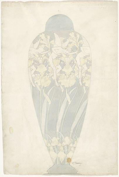
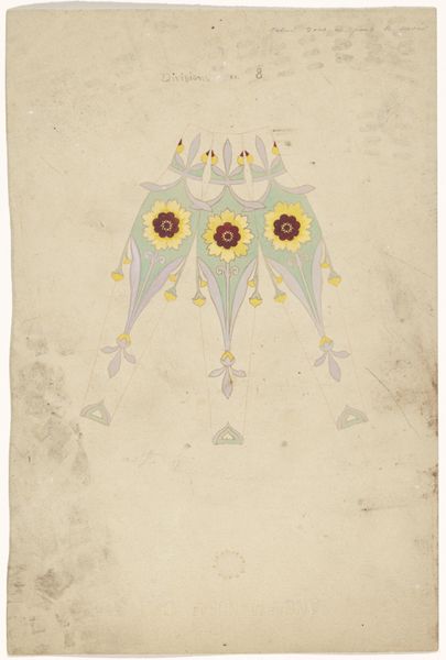
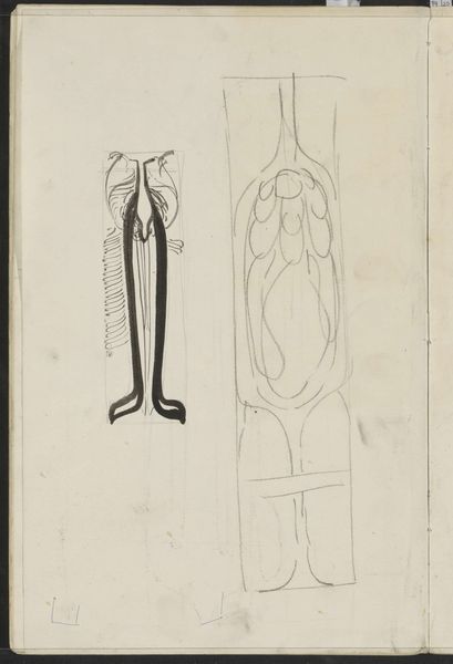
Drie segmenten van een met gestileerde coreopsis beschilderde vaas met daarnaast een schets van het silhouet van de vaas 1897
0:00
0:00
drawing, paper, watercolor
#
drawing
#
art-nouveau
#
vase
#
paper
#
watercolor
#
watercolour illustration
Dimensions: height 186 mm, width 274 mm
Copyright: Rijks Museum: Open Domain
Curator: Let’s delve into this watercolor drawing by Anatole-Alexis Fournier, dating back to 1897. Titled "Drie segmenten van een met gestileerde coreopsis beschilderde vaas met daarnaast een schets van het silhouet van de vaas," it essentially presents us with design elements for a vase, coupled with a delicate outline. Editor: My first impression is one of quiet elegance. The muted palette, the way the stylized flowers are presented—it evokes a sense of refined taste and the aspirations of the Art Nouveau movement. But there is also the undeniable focus on the object as commodity with the study on presentation. Curator: Exactly! The piece embodies the Art Nouveau desire to elevate everyday objects, like a vase, into works of art. These vases were not merely vessels, but statements reflecting the consumer's cultural sophistication, echoing broader societal shifts. One cannot overlook, say, how women were also packaged in the cultural and design contexts of that era. Editor: From my perspective, it underscores the material processes integral to creating beautiful objects, how function and aesthetic ambitions were considered in conjunction, the watercolor medium in contrast with the proposed solidity of the finished work. And beyond the individual craftsman, there's an entire industry at play here, with various types of labor involved to manufacture and market items. Curator: That is definitely tangible; however, the choice of the coreopsis flower holds its meaning. These cheerful blossoms were then gaining popularity, entering bourgeois homes. And this resonates with many new consumers who were also trying to access these upper circles. It speaks volumes about the rising middle class, seeking to assert its taste. The delicate lavender-green color palette would definitely complement those gender constructs you speak about. Editor: Right, but think about the practicalities too. Consider how color choices might have been driven by then-available pigments and glazes, the vase production techniques determining which floral designs can work, or which materials were cost-effective. It gives another, practical view of cultural symbolism. Curator: Indeed. Viewing it through the lenses of material production is useful and productive. Yet, remember that design, even back then, never existed in isolation. There were strong ideas and ideologies at work to determine access to resources and power and cultural significance that we cannot afford to dismiss. Editor: Ultimately, the synthesis between social context and production is what gives this piece its staying power. Curator: Agreed. It prompts questions about art’s place in shaping not only our environments but our collective understanding of identity too.
Comments
No comments
Be the first to comment and join the conversation on the ultimate creative platform.
More like this