Copyright: CC0 1.0
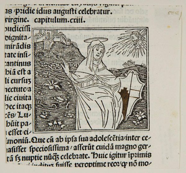
Editor: Here we have an anonymous piece titled "Saint Serapia." It's striking how linear the composition is, with such sharp, defined lines. What stands out to you most about its formal qualities? Curator: The contrasting textures achieved through the woodcut technique command attention. Notice the density of lines creating areas of shadow, set against the stark white of the page. This interplay generates a compelling visual rhythm. How does that linearity influence your perception? Editor: I think it makes it seem very direct, almost like a diagram. It's less about emotion and more about conveying a message. Curator: Precisely. The deliberate arrangement of these graphic elements—the saint, the heart, the text—forms a symbolic language. Consider how each element contributes to the overall meaning. Editor: So, it's all about breaking down the lines and shapes to understand the artist's intention. Curator: Yes, and appreciating how form and content are inextricably linked. It offers insight into not only the subject but the very process of representation.
Comments
No comments
Be the first to comment and join the conversation on the ultimate creative platform.
More like this