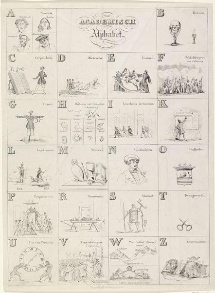
Vervolg van het nieuw prentkundig ABC voor lieve kinderen, met toepasselyke versjes 1856 - 1900
0:00
0:00
graphic-art, print, engraving
#
graphic-art
#
narrative-art
#
comic strip
# print
#
folk-art
#
decorative-art
#
engraving
Dimensions: height 306 mm, width 397 mm
Copyright: Rijks Museum: Open Domain
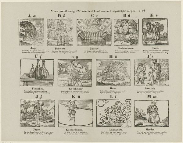
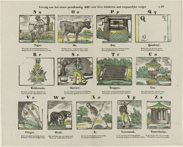
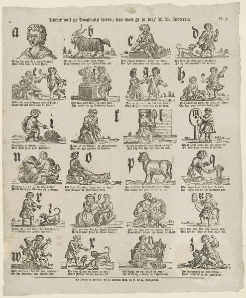
Curator: Here we have "Vervolg van het nieuw prentkundig ABC voor lieve kinderen, met toepasselyke versjes" which roughly translates to “Continuation of the new illustrated ABC for good children, with applicable verses,” made sometime between 1856 and 1900. The printmaker goes by the name of Monogrammist JZ. This print reminds me of an alphabet sampler, each square trying to illustrate the featured letter. What are your first thoughts about the visual structure of this work? Editor: I notice that each letter has a corresponding illustration and poem beneath it. It seems like a tool for teaching children the alphabet, though some of the imagery seems quite antiquated. What do you see when you examine the piece through a formal lens? Curator: Immediately, I’m drawn to the organization. The grid format dictates the composition; each square, a self-contained unit, relates to the whole. Notice how the engraver uses line weight and density to create visual interest within each block. It's primarily decorative-art, rather than fine art. What is your reaction to that? Editor: Yes, now that you point it out, I see how each little scene almost repeats the same structure. Is the variety of figures, the ox, the man with a shovel, etc., still relevant to a formalist reading? Curator: Precisely. While the subjects vary, the artist's treatment remains consistent. The figures are simplified, almost stylized, existing primarily to define the letter and illustrate the verse. It’s less about representation and more about design, line and form taking precedence. And what are your thoughts about how the formal design choices affected the work as a whole? Editor: It’s amazing how the structure highlights both the utility and artistic value. I hadn’t quite grasped that on my own initially, but this perspective truly elevated the whole viewing experience for me.
Comments
No comments
Be the first to comment and join the conversation on the ultimate creative platform.
More like this