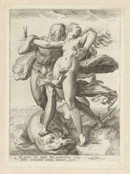
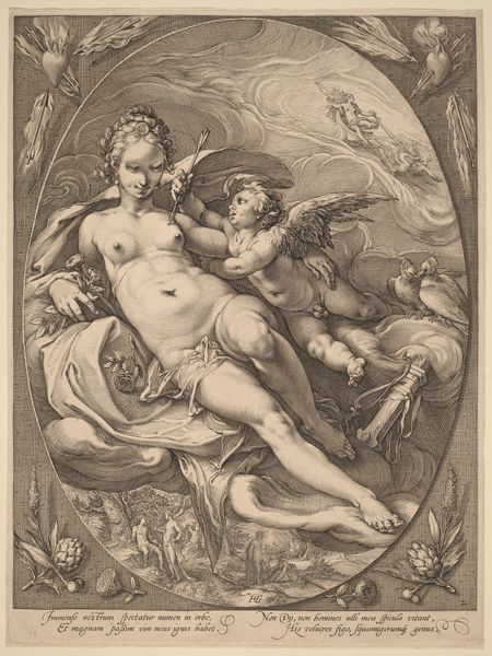
print, engraving
#
portrait
#
allegory
#
baroque
# print
#
caricature
#
figuration
#
limited contrast and shading
#
line
#
portrait drawing
#
nude
#
engraving
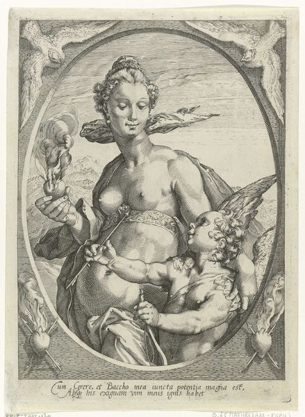
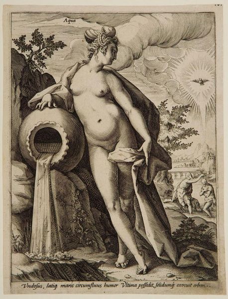
Dimensions: height 353 mm, width 270 mm
Copyright: Rijks Museum: Open Domain
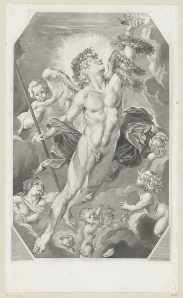
Editor: This is Jacob Matham's "Venus en Amor op de wolken," from between 1599 and 1603, a print housed in the Rijksmuseum. I am struck by the almost hyper-defined linework which gives a dramatic flair despite the absence of strong tonal contrast. How do you interpret the piece focusing on the relationship between form and meaning? Curator: Note how Matham utilizes the engraving technique, prioritizing line to delineate form. Observe the distinct lack of chiaroscuro; rather, value is achieved through density and direction of the lines. The subjects, Venus and Cupid, are constructed through complex systems of cross-hatching and parallel lines, emphasizing a concern for descriptive accuracy over emotional depth. Editor: So the formal constraints almost dictate a certain kind of emotional reading? The texture makes up for contrast in dark and light. Curator: Precisely. In the rendering of the cloudscape, for example, the formal strategy effectively evokes a sense of ethereal weightlessness through delicate linework. Consider how that effect would be changed if Matham relied instead on tonal modeling, through a medium such as charcoal. Also, note the oval form around the whole artwork; it provides structure but what does that form create when the space is largely filled with the figures and clouds? Editor: It does look less 'natural', so to speak. It puts even more emphasis on artifice and display. The artificial, curving line constrains the boundless heaven! I am starting to appreciate the degree to which his stylistic choices determine how we understand this baroque allegory. Curator: Agreed. Reflecting upon the artist’s deliberate orchestration of visual elements brings heightened clarity of his methods.
Comments
No comments
Be the first to comment and join the conversation on the ultimate creative platform.
More like this