acrylic-paint
#
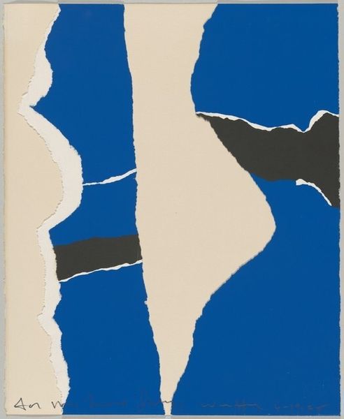
negative space
#
minimalism
#
landscape
#
pop art
#
colour-field-painting
#
acrylic-paint
#
acrylic on canvas
#
geometric
#
abstraction
#
pop-art
#
line
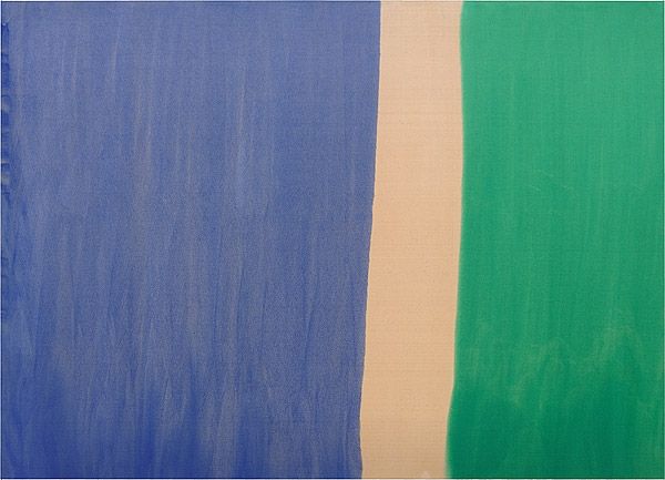
Copyright: Raoul De Keyser,Fair Use
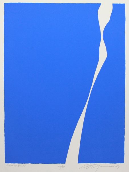
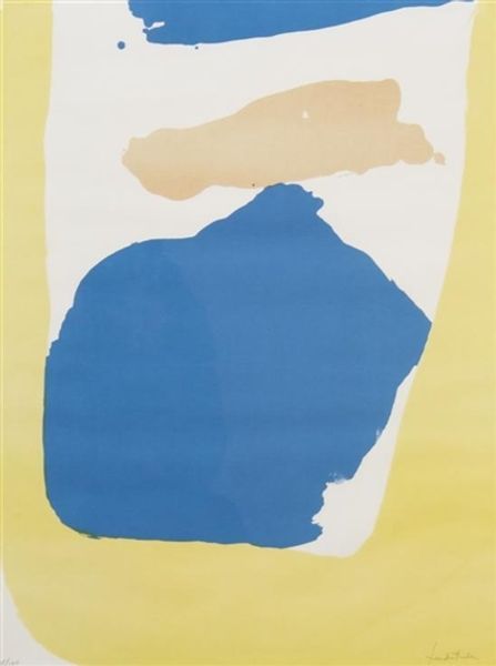
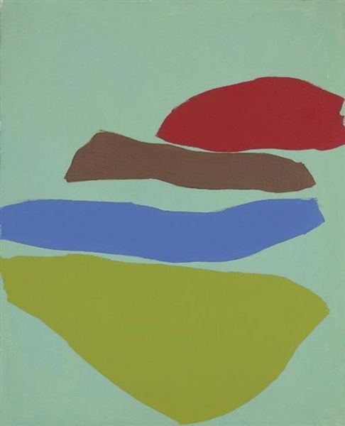
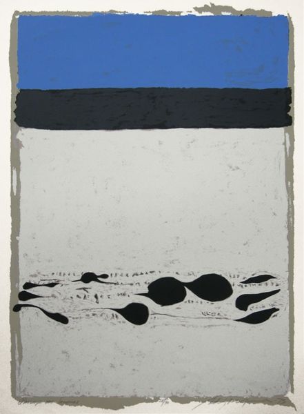
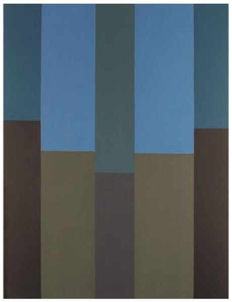
Curator: Here we have Raoul De Keyser’s "Camping II" from 1970, an acrylic on canvas piece. What are your initial thoughts? Editor: It’s strikingly simple, almost brutally so. A bold blue mass against a green field and a creamy sky—immediately conjures the naivete and anxieties linked to leisure and escape in the 70s. Curator: The boldness in the geometric composition indeed reflects the Colour Field painting style and Pop Art influences. How do you see these influences impacting our understanding of landscape? Editor: Colour Field offered De Keyser an ability to use expanses of color to express pure, distilled feeling. And this raw, almost poster-like simplicity subverts landscape tradition. No romanticism, just flat, hard color—like the promises of nature and open space were packaged for mass consumption, then left unfulfilled. Curator: Interesting, I find the simple shapes creating a sort of psychological landscape, too. The suggestion of familiar shapes allows our memory to add the sensory information we associate with these settings: the warmth of a tent, sounds of nature, creating a tranquil if not idealized space. Editor: Is it tranquil, though, or simply emptied? The "negative space" feels aggressive—are we looking at a space cleared by and for… whom? There is a lot of unfulfilled expectations in there, for me. And who benefits from our distraction and supposed connection with the pastoral? The black outline adds to this feeling for me, drawing my eye away. Curator: Ah, yes. I agree that stark outline adds an unfulfilled sense of longing within this setting. We may think that in simplifying the landscape, De Keyser hoped to clarify nature as an abstract entity. The symbolic tent evokes a longing for connection. Editor: Maybe the “Camping” title serves as ironic counterpoint, signaling the commodification of this primal longing itself. We strive for simpler life by connecting with nature but our efforts turn the pastoral into a brand experience! Curator: The use of color as pure emotion, the subtle distortions of form—it really does speak volumes about a time grappling with both simplicity and disillusionment. Editor: Right. An open landscape, devoid of comfort! What begins as freedom easily shifts into a mirror that exposes societal longing and artifice.
Comments
No comments
Be the first to comment and join the conversation on the ultimate creative platform.
More like this