drawing, ink, pen
#
drawing
#
ink drawing
#
pen drawing
#
pen sketch
#
ink
#
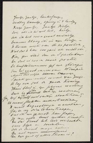
pen
#
calligraphy
Copyright: Rijks Museum: Open Domain
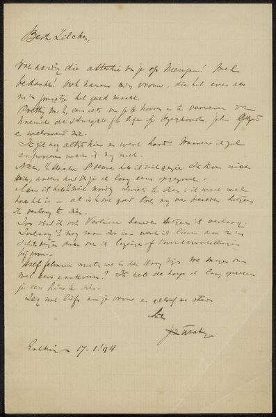
Editor: So, here we have "Brief aan Philip Zilcken" by Eduard Karsen, potentially created between 1901 and 1911, using pen and ink. I am fascinated by the script and the stark contrast. It feels intimate, almost like intruding on a personal moment. What visual elements stand out to you in this letter? Curator: The most compelling aspect is undoubtedly the interplay of line and form created by the penmanship. Note the variation in line weight; the deliberate thickening and thinning, creating a visual rhythm across the page. Observe the structural integrity achieved solely through these calligraphic marks. Does the handwriting itself evoke a certain feeling in you, beyond the semantic meaning of the words? Editor: It feels very deliberate, each stroke precisely placed. It also makes it feel old, formal maybe. Does the lack of shading and color have a particular significance? Curator: Precisely. The absence of colour or tonal shading throws emphasis onto the negative space. Look at the relationship between the letterforms and the off-white page - how one defines the other. The spatial dynamic adds another layer of meaning. Furthermore, consider the orientation. Does its verticality remind you of any other artistic traditions? Editor: I see what you mean! I guess calligraphy does rely on the stark contrast between line and ground. I had never thought to apply that same approach to this kind of writing before. Curator: Exactly! By recognizing these relationships and inherent qualities of the medium, we can better understand and appreciate Karsen’s artistic intention, even within a seemingly utilitarian form like a letter. Editor: I’m starting to see the intentionality behind every stroke now! It's almost as if the handwriting becomes its own abstract composition.
Comments
No comments
Be the first to comment and join the conversation on the ultimate creative platform.
More like this