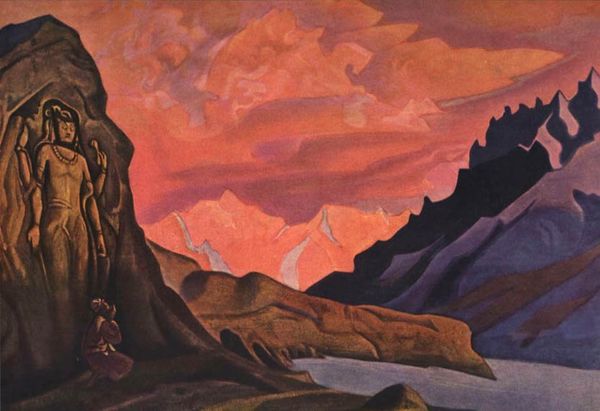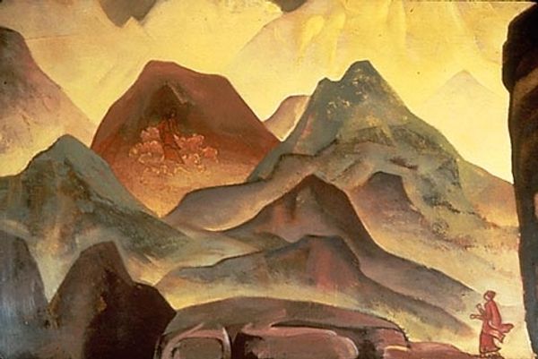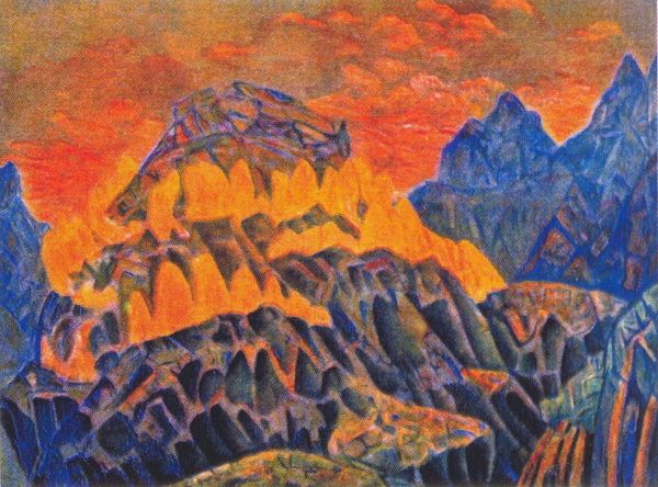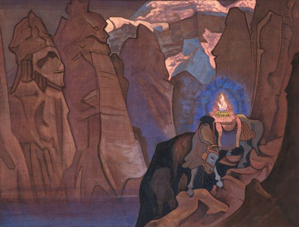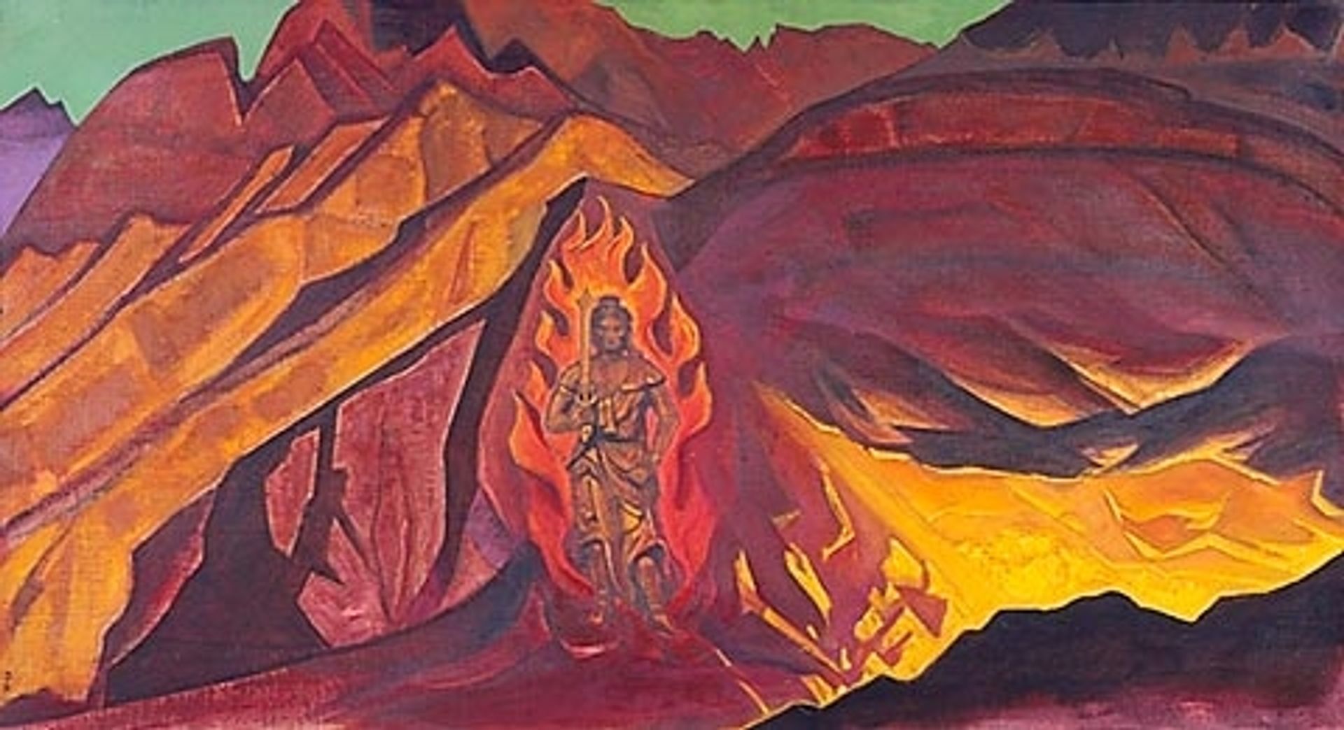
1927
Guardian of the Entrance
Nicholas Roerich
1874 - 1947Location
Private CollectionListen to curator's interpretation
Curatorial notes
Editor: This is "Guardian of the Entrance," an oil painting by Nicholas Roerich from 1927. The fiery colors and jagged mountains give it such a dramatic and imposing feel. How do you interpret this work, focusing on its visual language? Curator: Primarily, one must acknowledge Roerich's emphasis on form and color to convey meaning. The composition is strikingly divided into distinct, almost geometric planes, utilizing a restricted palette of fiery oranges, reds and muted purples. Observe how the central figure, engulfed in flames, is rigidly symmetrical, and yet seamlessly integrated within the landscape's structure. Do you perceive a hierarchy in the placement of forms and coloration, creating a focus point within the landscape? Editor: Yes, the figure in flames is definitely the focal point; the eye is drawn immediately to the center. The use of brighter oranges makes it stand out against the darker, cooler mountain colors. It's a figure *within* the mountainscape but separate from it because of that color and clarity. Curator: Precisely. The chromatic intensity of the figure juxtaposed with the surrounding peaks, signals a key formal aspect. It becomes clear that the "guardian" embodies the idea of symbolic "entrance" to the peaks beyond. Editor: So, by simplifying and intensifying the colors and shapes, Roerich is guiding us toward a particular reading? Curator: Yes, the symbolic is embedded in his formal approach, revealing itself through structured visual relations. Note how that figure appears simultaneously powerful and vulnerable. Roerich skillfully exploits pictorial space to enhance allegorical content through strictly visual methods. Editor: That’s fascinating! I had not considered how deliberately he seemed to be manipulating the pictorial structure. Thanks for expanding my understanding by considering form first.