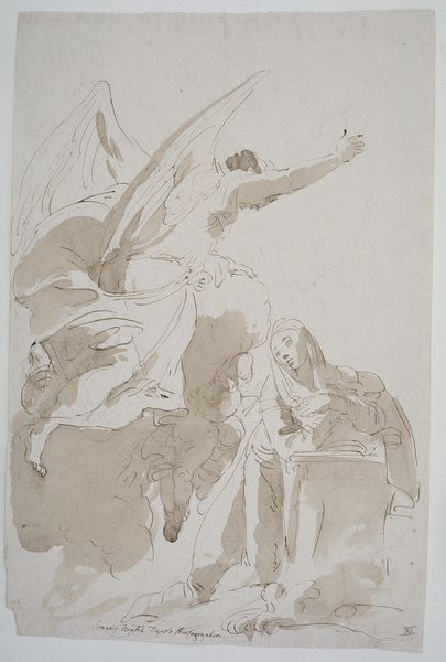
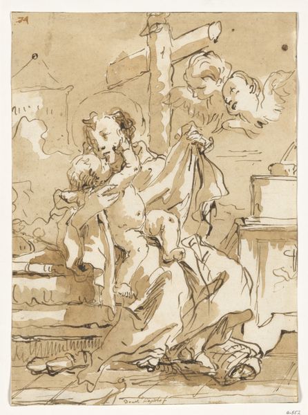
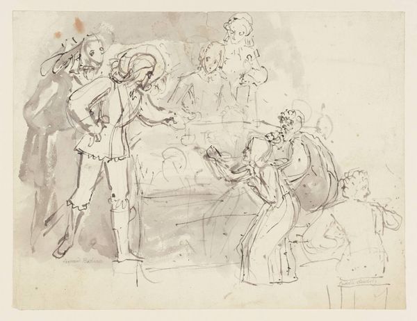
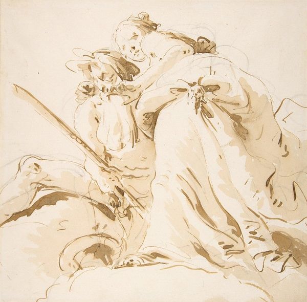
The Holy Family with Saint John 1751 - 1765
0:00
0:00
drawing, paper, ink
#
drawing
#
baroque
#
figuration
#
paper
#
ink
#
history-painting
Dimensions: 11 7/16 x 7 15/16 in. (29.1 x 20.2 cm)
Copyright: Public Domain
Curator: Before us we have "The Holy Family with Saint John," a drawing attributed to Giovanni Battista Tiepolo, likely created between 1751 and 1765. It’s currently housed at the Metropolitan Museum of Art. Editor: It’s captivating! The dynamism implied in these sketched figures evokes, almost viscerally, a sacred domestic moment caught in time. It gives a strong sense of form with great economy. Curator: Absolutely. The composition hinges on the spiraling arrangement of figures, a trademark of the Baroque. Observe how Tiepolo uses layered washes of ink to establish depth and to bring light, despite the absence of explicit tonal variation across the page. Editor: Focusing on the ink, I’m struck by its immediate accessibility. It brings to the forefront the artist's hand, making his labour so apparent. Was the support readily available and the ink easily manufactured in Venice at this time? The drawing comes off as deliberately rapid— almost like a stage set in early planning, a record of both technical and intellectual processes. Curator: That reading is compelling, given its material economy, but let’s consider the historical expectations of such a sketch. While the sketch reveals the process, it's essential to appreciate the conventions Tiepolo employed. Consider how he leverages the religious theme: The subtle but definite positioning of the heads, which lead one's eyes up the work from the Holy family to Saint John. It indicates the work's place in art historical canons. Editor: Yes, but if you closely scrutinise the figures, are the faces given a hierarchy? I think their placement suggests one. Instead, their faces become of a similar presence in the plane and through materiality—they almost form one plane of work through the medium. And look at the economy with which that plate has been made: even the deliberate whiteness of the negative space evokes just how little was consumed to produce something of significant emotional force. Curator: Indeed. It demonstrates an adept control of ink. It does draw my eye more readily to its spatial presence... but what do you see that indicates that? Editor: It's how each ink blot's relationship contributes toward the broader design. Its tonal depth doesn't attempt to define "a spiritual presence," yet brings our understanding down to the material truth through which those narratives were traditionally built. And ultimately, doesn't that materiality tell us so much about how such devotional images functioned within 18th-century Venetian society? Curator: Perhaps we both see within this deceptively simple work an engagement between the divine and the practical, caught deftly in ink. Editor: Ultimately, in seeing these sketches for their construction of work, it grants great appreciation to an artist whose mode of work and consumption of his materials we can see readily today.
Comments
No comments
Be the first to comment and join the conversation on the ultimate creative platform.
More like this