About this artwork
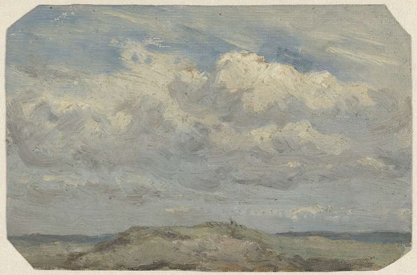
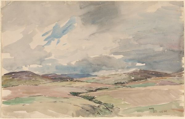
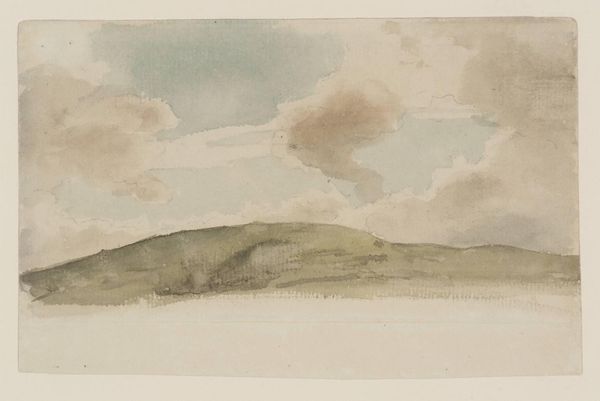
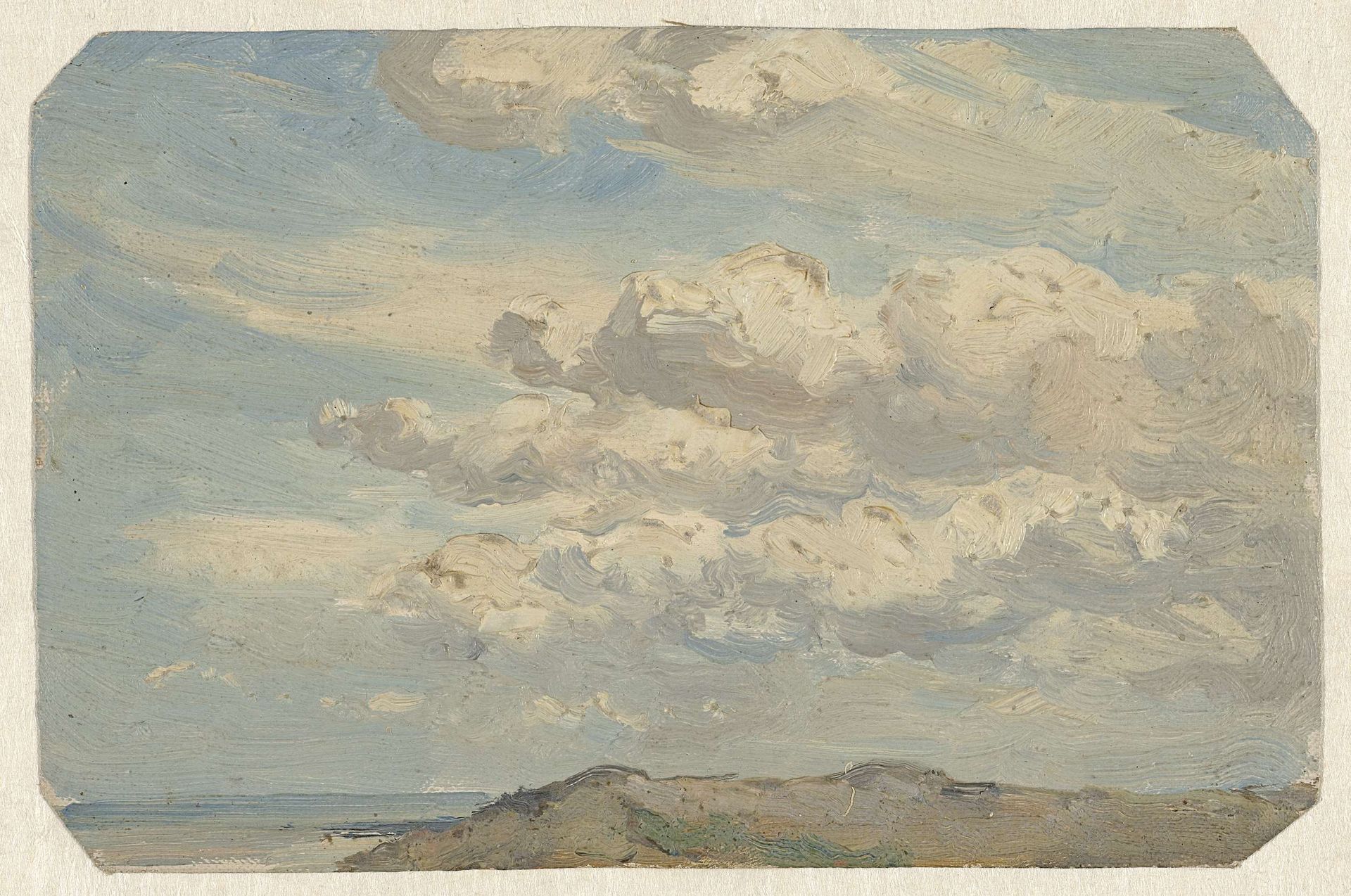
Editor: This is "Duintop met links de zee" by Jan Willem van Borselen, painted sometime between 1835 and 1892. It’s a watercolor painting, and looking at it, I'm really struck by how the cloud formations dominate the composition. What do you see in this piece from a formalist perspective? Curator: I find the visual organization of this landscape to be quite compelling. The artist utilizes a clear division of space: a relatively muted lower register of earth and sea anchoring the work, with a dynamically active sky occupying the majority of the picture plane. The brushstrokes themselves contribute significantly; short, choppy strokes build texture in the clouds, suggesting movement and volume. Note the limited palette; the artist seems interested in exploring subtle tonal variations within a restricted range. How do you feel this contributes to the overall impact? Editor: It definitely creates a sense of unity, but almost a somber one? The muted tones and the emphasis on the clouds, it feels a bit melancholic. Curator: Interesting. Consider also the orientation and placement of the dune top: low on the horizon. This serves to emphasize the vastness of the sky. There’s a delicate balance between representation and abstraction here. It appears to me as an attempt to capture not just a view, but perhaps a feeling – a subjective experience of observing the landscape. Would you agree? Editor: I see what you mean! It's less about documenting the place exactly and more about capturing the light and atmosphere. I hadn’t thought about the feeling the brushstrokes themselves evoke. Curator: Indeed. This painting really shows the power of formal elements to contribute to a complex visual statement. Editor: I've learned a lot about looking more closely at the artist's choices, like brushstroke and color palette. It makes the painting more meaningful. Curator: Precisely. By focusing on these elements, we unveil the aesthetic structure, and begin to grasp the artist’s overall vision for the artwork.
Artwork details
- Medium
- painting, plein-air, watercolor
- Dimensions
- height 123 mm, width 187 mm
- Location
- Rijksmuseum
- Copyright
- Rijks Museum: Open Domain
Tags
Comments
Share your thoughts
About this artwork
Editor: This is "Duintop met links de zee" by Jan Willem van Borselen, painted sometime between 1835 and 1892. It’s a watercolor painting, and looking at it, I'm really struck by how the cloud formations dominate the composition. What do you see in this piece from a formalist perspective? Curator: I find the visual organization of this landscape to be quite compelling. The artist utilizes a clear division of space: a relatively muted lower register of earth and sea anchoring the work, with a dynamically active sky occupying the majority of the picture plane. The brushstrokes themselves contribute significantly; short, choppy strokes build texture in the clouds, suggesting movement and volume. Note the limited palette; the artist seems interested in exploring subtle tonal variations within a restricted range. How do you feel this contributes to the overall impact? Editor: It definitely creates a sense of unity, but almost a somber one? The muted tones and the emphasis on the clouds, it feels a bit melancholic. Curator: Interesting. Consider also the orientation and placement of the dune top: low on the horizon. This serves to emphasize the vastness of the sky. There’s a delicate balance between representation and abstraction here. It appears to me as an attempt to capture not just a view, but perhaps a feeling – a subjective experience of observing the landscape. Would you agree? Editor: I see what you mean! It's less about documenting the place exactly and more about capturing the light and atmosphere. I hadn’t thought about the feeling the brushstrokes themselves evoke. Curator: Indeed. This painting really shows the power of formal elements to contribute to a complex visual statement. Editor: I've learned a lot about looking more closely at the artist's choices, like brushstroke and color palette. It makes the painting more meaningful. Curator: Precisely. By focusing on these elements, we unveil the aesthetic structure, and begin to grasp the artist’s overall vision for the artwork.
Comments
Share your thoughts