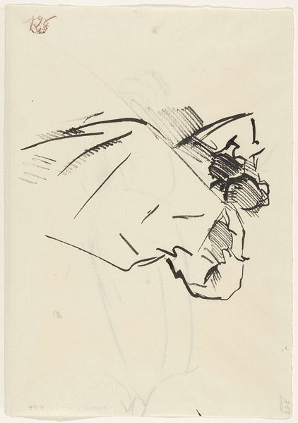
drawing, ink
#
portrait
#
drawing
#
shading to add clarity
#
caricature
#
figuration
#
ink
#
ink drawing experimentation
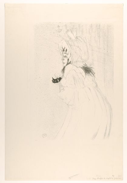
Dimensions: height 303 mm, width 186 mm
Copyright: Rijks Museum: Open Domain
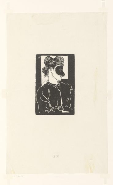
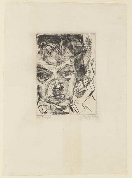
Karel Thole made this cover design for N.S. Ljeskow’s “The Immortal” in 1965, and it looks like it was made with ink on paper. It’s all about the face, isn’t it? All that stark black ink against the white. I love how the marks form a face, a beard that comes right up to the edge of the frame. It’s like Thole is feeling out the boundaries of his space, seeing how much he can get away with. The inky black of the beard seems to push forward, contrasting with the more delicate lines around the eyes, nose and forehead. These are sketched in and almost tentative, contrasting with the confidence of the beard. For me, this approach to contrasting inkiness and tentative line work reminds me of some of Picasso’s drawings, but with an added graphic punch. Ultimately, this piece shows how even a simple ink drawing can convey so much about form, space, and feeling. It’s not just a portrait, it’s a statement.
Comments
No comments
Be the first to comment and join the conversation on the ultimate creative platform.
More like this