drawing, paper, ink, pen
#
drawing
#
script typography
#
hand-lettering
#
old engraving style
#
hand drawn type
#
hand lettering
#
paper
#
ink
#
hand-drawn typeface
#
ink drawing experimentation
#
pen-ink sketch
#
abstraction
#
pen work
#
pen
#
coloring book page
#
modernism
#
calligraphy
Copyright: Rijks Museum: Open Domain
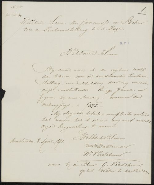
Curator: Looking at "Brief aan Philip Zilcken," a drawing possibly from 1927 by Françoise de Bas, immediately evokes the sensation of finding a forgotten correspondence, wouldn't you say? Editor: It does, yes. The monochrome palette and concentration on hand-lettering yield a visually arresting composition of positive and negative space, where the text commands all the attention. I immediately gravitate toward its stark linearity, this interplay is powerful. Curator: Beyond the compositional arrangement, calligraphy itself represents the personality and intention of the writer. The sweeping cursive speaks to a very specific moment in time, but how can we interpret its symbolic meaning today? Do you feel any resonance beyond its surface appeal? Editor: Semiotically, the form mirrors content: It *is* a letter. The elegance of each curve reminds me that penmanship once carried a strong sense of personhood and identity. In that sense, even though the linguistic content is obscure, we gain entry into the cultural ideals embedded in something as basic as handwriting. Curator: I see it as an articulation of connection through historical documentation and shared cultural memory. The act of writing becomes the focal point, communicating personal connection and intent. This work resonates so deeply, like finding an intimate message in a bottle. It creates links beyond its immediate context. Editor: Ultimately, regardless of content or context, this piece is driven by pure compositional clarity—and that alone gives "Brief aan Philip Zilcken" significant artistic merit. De Bas makes line speak volumes.
Comments
No comments
Be the first to comment and join the conversation on the ultimate creative platform.
More like this