Dimensions: height 378 mm, width 535 mm
Copyright: Rijks Museum: Open Domain
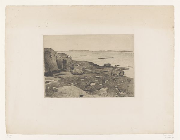
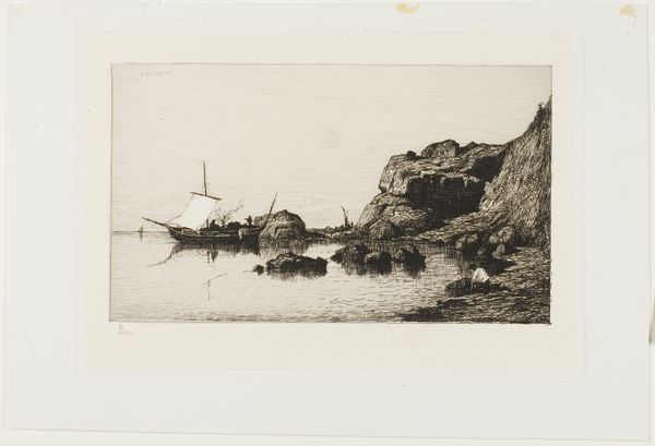
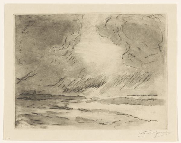
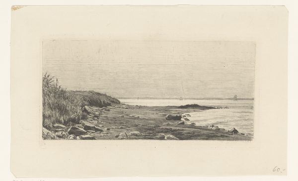
Editor: This is "Bretonse kust" by Maxime Maufra, an etching created sometime between 1871 and 1918. The textures, from the water to the rocks, are fascinating, but the work is quite muted. How would you interpret this piece from a formal perspective? Curator: The power of the work resides in its masterful manipulation of line and tone. Notice the sharp, decisive lines defining the rocks in the foreground. These contrast markedly with the softer, more diffused etching used to render the sky and sea. Consider how Maufra creates depth using these contrasts. Editor: That's interesting. The distinct lines of the rocks are definitely what caught my eye initially. So you're suggesting the contrasting etching techniques contribute to the spatial depth within the image? Curator: Precisely. And further, observe how the composition directs the eye. The horizontal lines of the land and sea create a sense of stability, which is then disrupted by the organic shapes of the rocks, leading the viewer into the receding space of the landscape. How do you perceive the artist's use of light and shadow? Editor: Now that you mention it, the shading on the rocks gives them volume, but overall the work remains fairly monochromatic. It doesn't feel as concerned with capturing the true colors of a seascape. Curator: Precisely. Instead, the tonal gradations serve to articulate form and texture. In semiotic terms, one might argue the restricted palette directs attention away from surface realism, instead foregrounding the formal relationships within the work itself. Editor: I see now. By focusing on the line, tone, and composition, the work gains strength. I wouldn’t have thought of that! Curator: Indeed. Examining its formal properties opens rich possibilities for interpretation.
Comments
No comments
Be the first to comment and join the conversation on the ultimate creative platform.
More like this